Recommended
7 SEO Strategies to boost your website rankings and get more enquiries
Dave Ramrekha
In the ever-evolving digital landscape, search engine optimisation (SEO) remains a crucial aspect of any successful online business strategy.
It’s all things 20 at VIA Towers as we celebrate our 20th birthday in 2023 and what better way to kick off the festivities than to lay out our 20 tips for creating an effective logo design.
A logo serves many purposes for any business, including helping to get their message and values across to their target audience, as well as stand out from the crowd.
So with that in mind, we at VIA Creative thought we’d try and give a gentle nudge on how to produce the perfect on-brand logo design with our 20 (did we mention we’re celebrating 20 years of creativity in 2023!? Time flies) handy tips.
1. Do the research - knowing the industry and competitors can help to create a logo that sets your client apart.
2. Understand the target market / audience - having an understanding of your client’s audience can help you to clearly communicate what you can offer them and what values they can expect from you.
3. Question your clients - question any vagueness in their brief and find out exactly what you need to convey. This will help to manage expectations and set realistic goals.
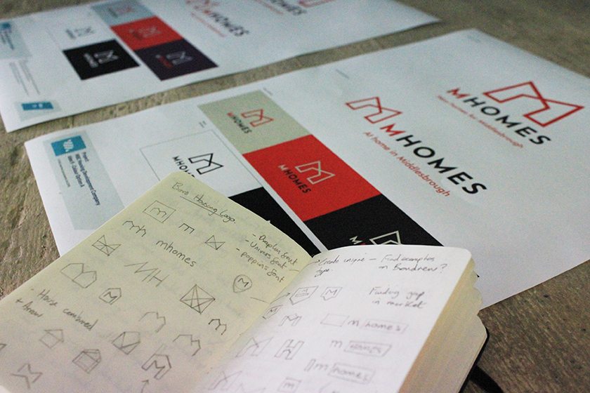
4. A pen and paper are your best friend - get everything you can down onto paper. Just empty your head of ideas, thoughts, sketches and more onto the page. You can create mind maps to help form visual connections and sketching helps to form the visual essence of your ideas before you worry about digitising them. RESIST THE MOUSE (for now).
Pic: Some initial pencil sketches created for our branding design project for the Middlesbrough Development Company, click the pic to visit the case study.
5. Create mood boards - collecting inspiration for a particular style you want to follow can help to give clarity to the direction you want to take, but analyse what you’ve collated and strive to do better.
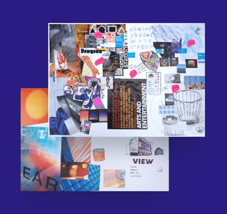 Pic: Mood board created for the Palace Hub building branding project we undertook for Redcar & Cleveland Council, click the image to view the case study.
6. Taking a break is a good thing - if you feel you’re at a dead end or that you’ve ‘ran out of ideas’, TAKE.A.BREAK. Disconnect for a while, get away from your desk. Once you feel that you’ve cleared your head, get back to the drawing board with fresh impetus. Good things take patience.
7. Start in black and white - when you begin to digitise your designs it can be really tempting to be overzealous with the colour palette. But colour is subjective and can really alter the look and feel of any design. So during those initial stages stick to black and white, it will help you to see the design more clearly.
8. Reflect the logo - horizontally and vertically! This will help to see any inconsistencies with the design or any unwanted hidden imagery. Just give it a flip every now and then.
9. Share your logo - this is similar to the previous point. Send your design to colleagues, friends and family for feedback. A new set of eyes is always useful and can help you look at the logo every which way possible.
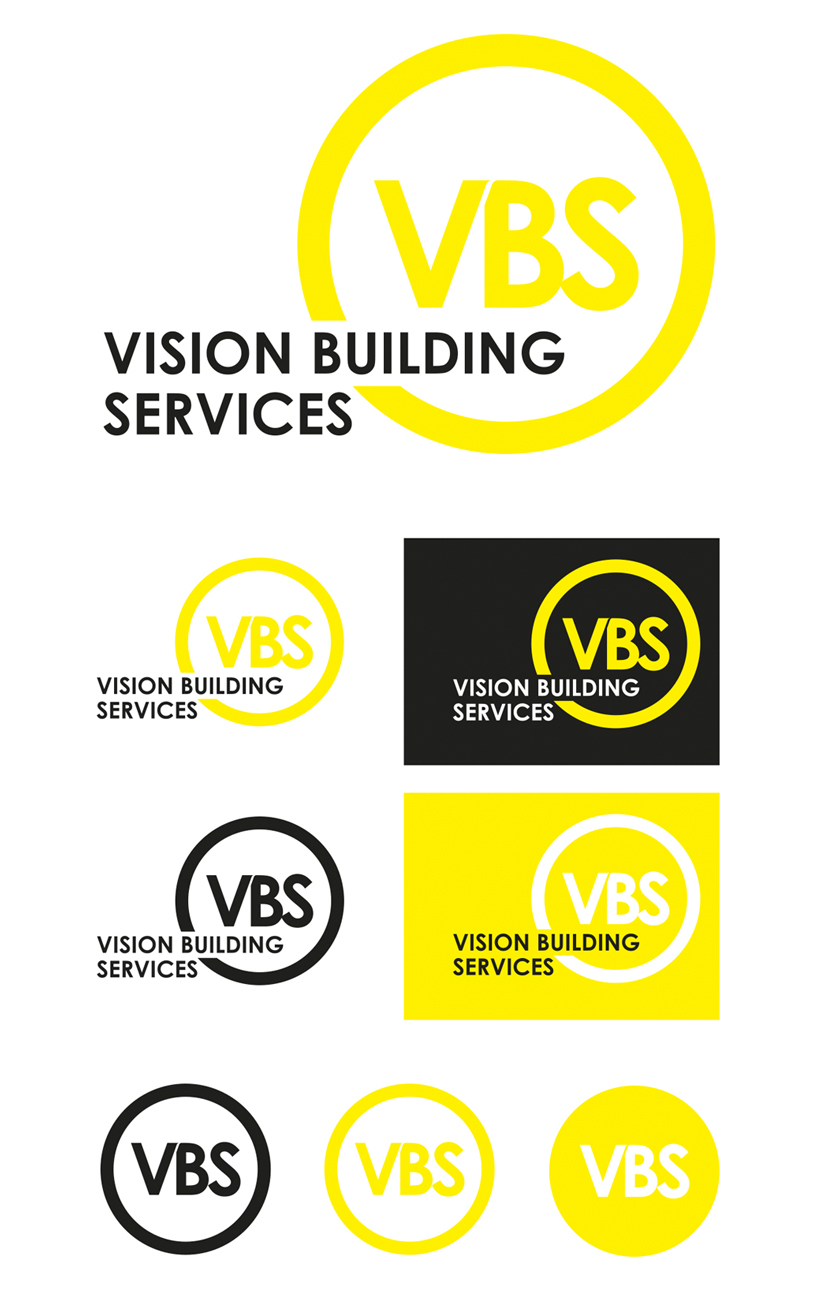
10. Create variations - a logo design needs to be versatile and work in numerous ways across different media. Creating variations can help show how your logo can work.
Pic: Variations of our logo design for Stockton based Vision Building Services. Click the image to view the branding case study.
11. Create a lockup - logos often use a tagline or brand message. Both elements can work separately but bring them together to create a lock-up. But remember, these are separate elements so don’t rely on the tagline to make sense of your logo design (or vice versa).
12. Space is your ally - let your logo breathe. Framing is often a tool used in logo design, but if things are looking a little cramped, enlarge the frame or reduce elements in size.
13. Create a scaleable design - your logo will be used at a range of sizes and it’s key to create a design that is sharp and recognisable, no matter what the size. USE VECTORS, DAMMIT.
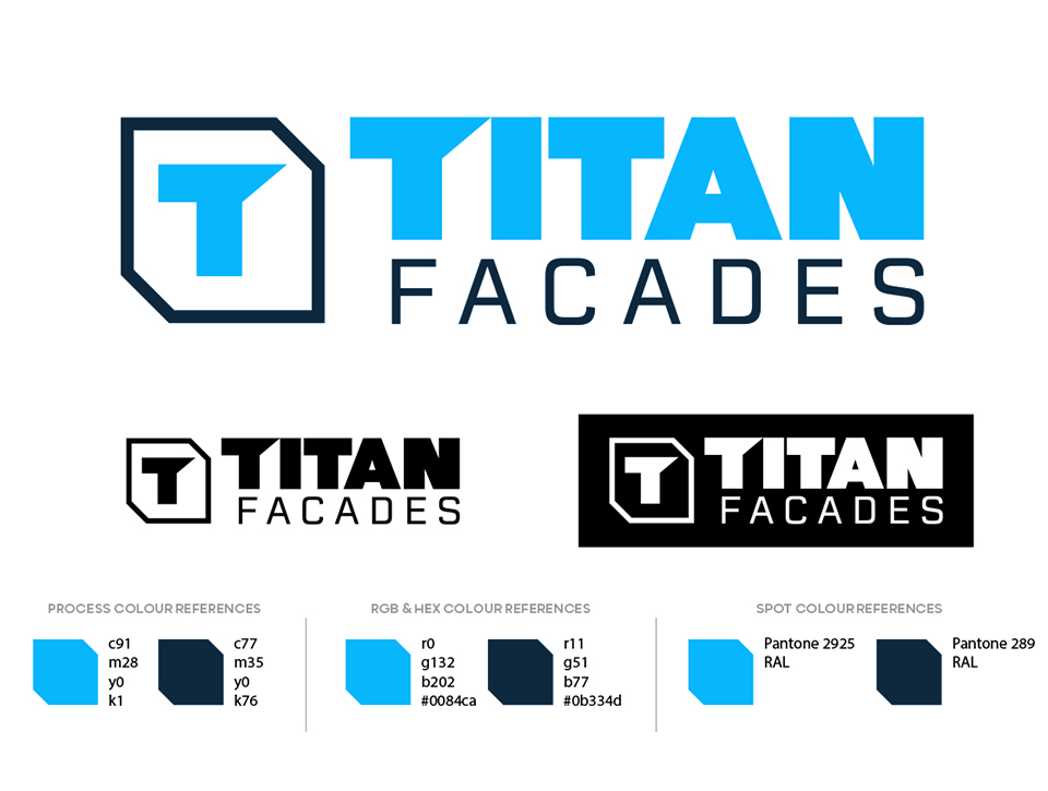
Pic: Our recent logo design for Titan Facades, Middlesbrough. Showing the scability of the logo along with colour references.
14. Make it readable - like point 13, it’s key to make sure any logo design is legible. Text should always be readable, otherwise what’s the point?
15. Be memorable - easier said than done, I know. But creating positive association with your logo can help your design stand the test of time. Which is funny because…
16. Future proof your design - there should be elements to your logo design that are timeless and can be appropriately updated to match ever-changing design trends. Think Nike or Coca-Cola.
17. Simplicity - subtracting and removing elements are a good thing. If you can’t rationalise a part of your logo’s design, the chances are you can probably leave it on the cutting room floor.
18. Remember you’re the designer - it’s important to get frequent feedback from your client, that’s a no-brainer. But it’s just as important to remember you’re the expert here and that’s why they’ve come to you. Sticking to your guns and making this clear from the start helps to avoid your design being diluted from the horrors of “MAKE IT POP”, “CAN WE MAKE IT BIGGER” or “How about we try this font…” (proceed to shudder as the font file for Papyrus drops)
19. Ask for specifics - when asking your client for feedback, don’t simply ask if they like it. Dig deeper. “Does this reflect your company and values?”, “Do you think the design matches the brief?”.
20. Have fun - Sorry to get all clichéd on you but we all know the process of any design can be frustrating at times - however, try to enjoy it. Experiment and don’t conform to ‘design norms’. Let your creativity flow.
Do you or your business need a logo (re)design or brand refresh? Let’s make a mark together.
https://viacreative.co.uk/services/branding



Comments
No comments have been posted yet!