VIA Creative

Company Naming and Branding Design

Middlesbrough Council, Public sector tender win

On the back of a tender win, Middlesbrough Council commissioned us to devise a range of new company names and associated branding design for their own commercial property company - MHomes.

Get a Free Quote

How can we help?

Please choose from one of our services, fill in your contact info and we'll be in touch as soon as we can.

Or contact us directly

01642 804534
studio@viacreative.co.uk


MHomes screenshot

The problem

Middlesbrough Council needed an agency to devise a series of new company names and a new brand that would reflect the company’s aims which was to intervene in the local housing market and to influence the pace, quality and choice of housing available in Middlesbrough through the provision of affordable homes which will be for sale or rent. This new company would provide a unique offer in Middlesbrough’s housing market. As a small to medium sized housing company its function would not be to compete but to intervene and plug the gap where the housing market fails to adequately provide for the needs of the population.

Our solution

We proposed a wide range of initial company names to the stakeholders. Following various discussions the name 'MHomes-New Homes for Middlesbrough' was agreed and we applied our brand design processes into the creation of some initial ideas and early visuals.

Initial brand idea generation

We submitted several initial ideas for the new branding and these were whittled down to the final choices. Our branding processes have been streamlined so that we can move quickly on design changes and amendments. The client came back with feedback to our various designs very quickly allowing us to push on with the next stage designs.

MHomes wireframe
MHomes wireframe
MHomes wireframe

FInal brand ideas

The client decided upon two options, a softer rounded version and a dynamic, pointed version of the logo, both of which were designed to reflect an 'M' with a negative space house shape.

FInal brand ideas image

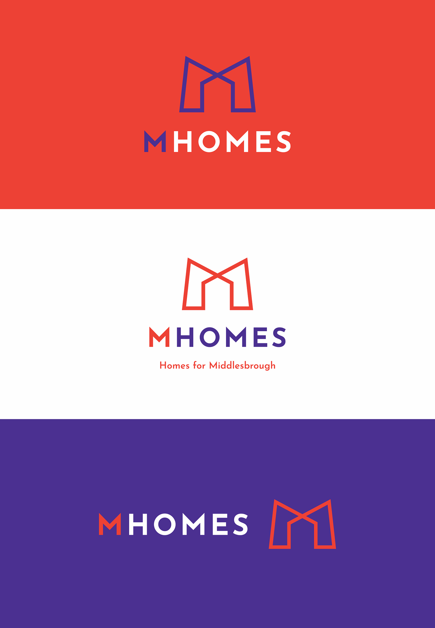
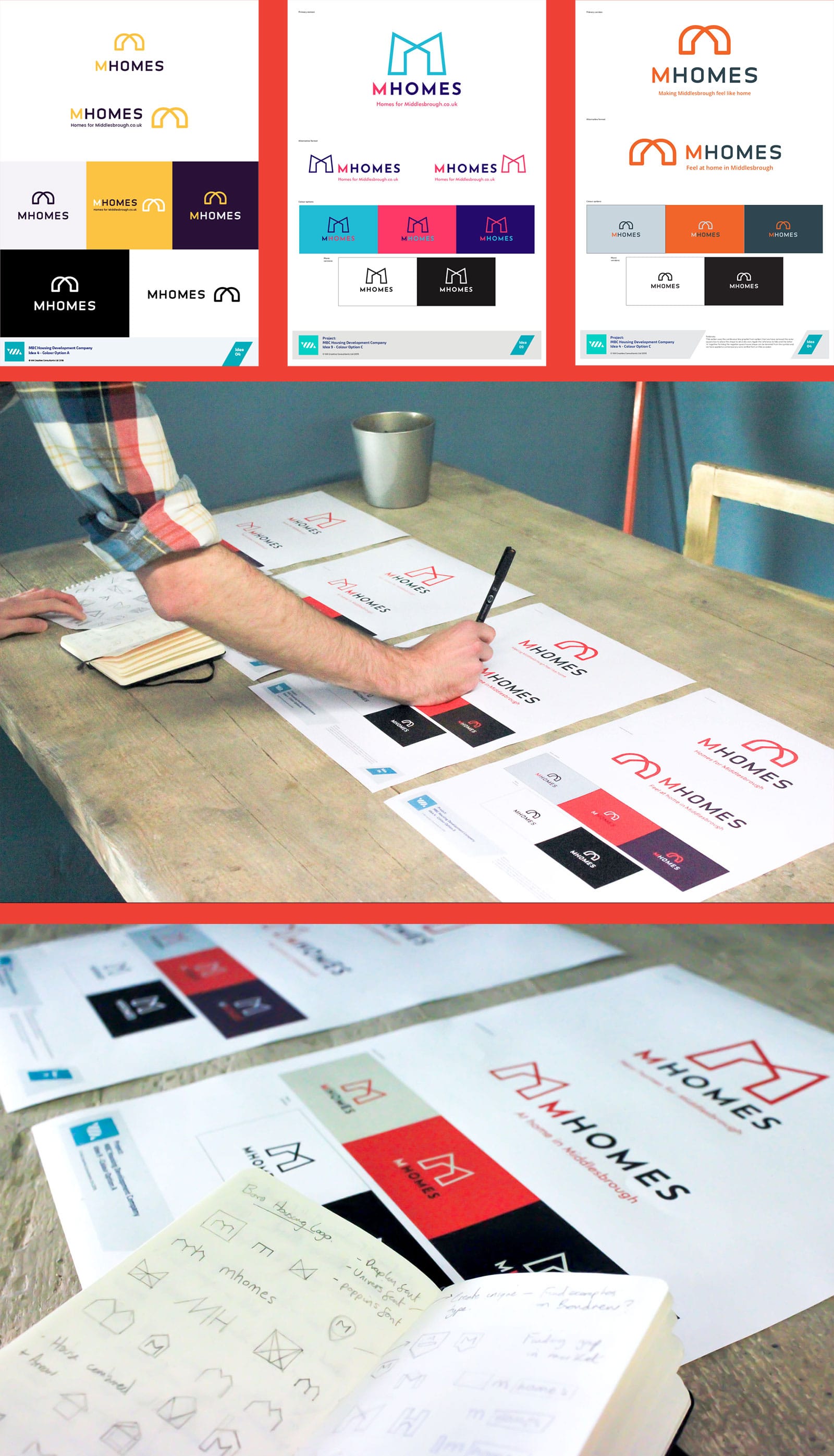
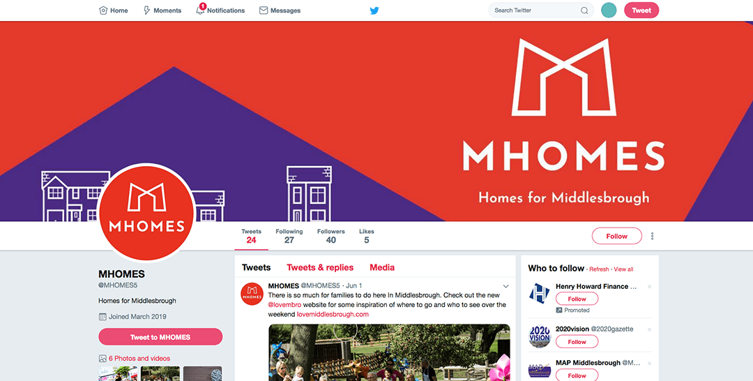
The final brand logo

The final chosen solution used a continuous line graphic symbol which was created to define the shape of a house using the negative space with the angle of the arches conveying strength and protection.

The symbol also denotes an underlying reference to Middlesbrough’s iconic Transporter Bridge. An all upper case sans serifed font was used to complement the symbol shape with a highlight placed by the colour change for the letter ‘M’ referencing Middlesbrough. The font chosen complements the shape of the symbol perfectly with its pointed letter ‘M’ angles.

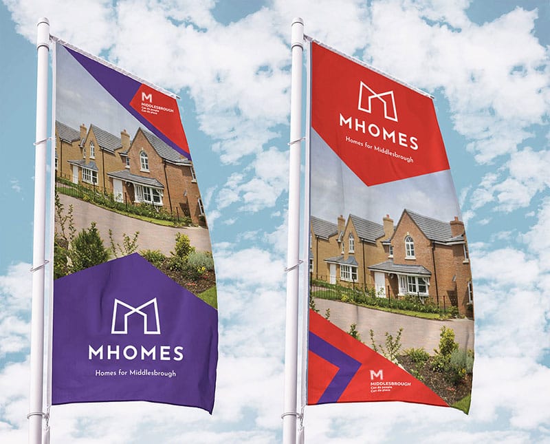
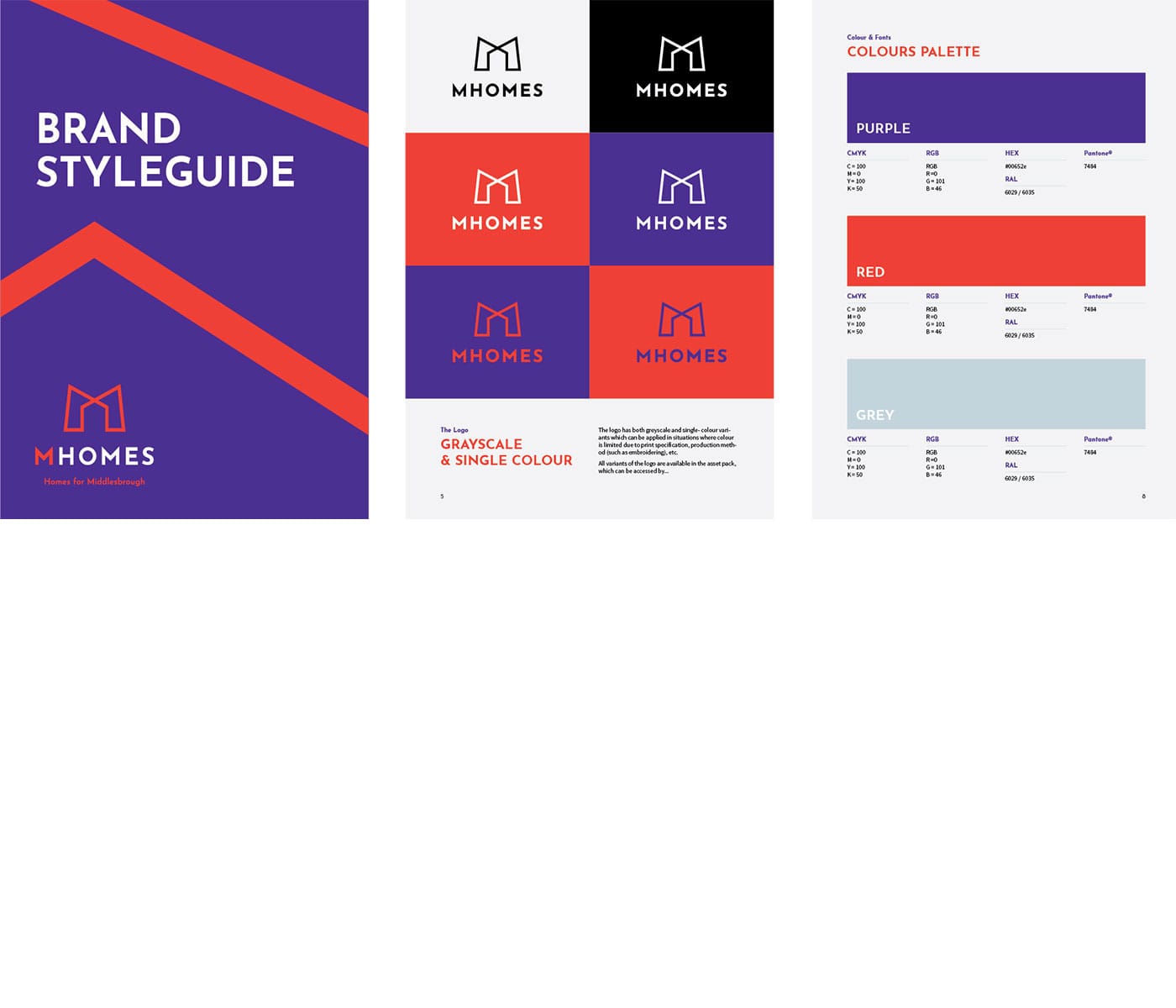
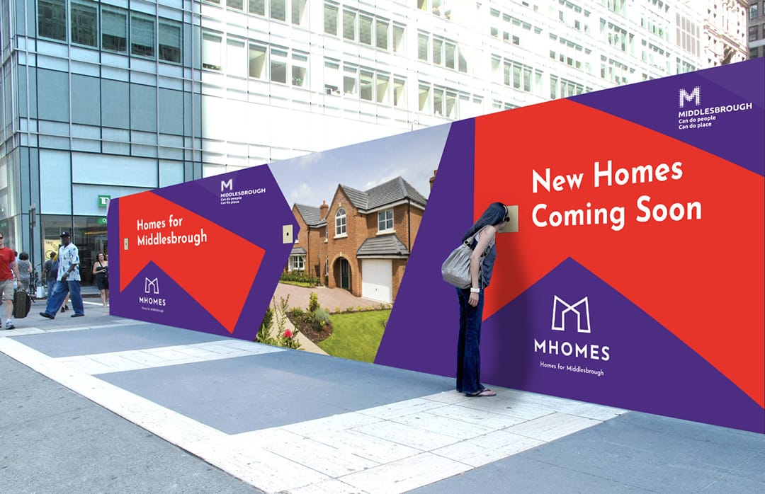
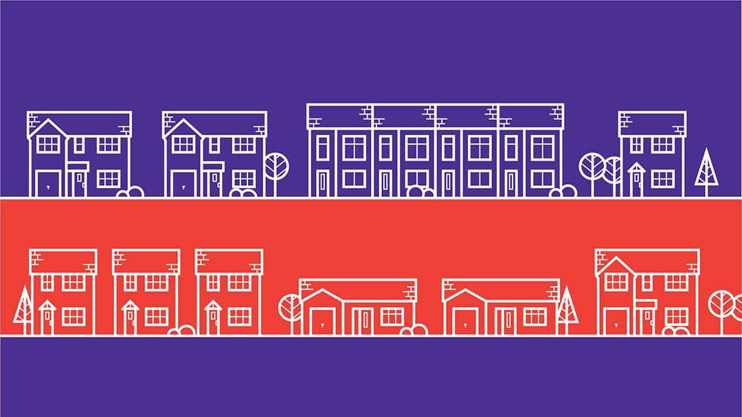
We also created a full brand styleguide to accompany the new logo, with pages on correct usage, fonts, colours and tone of voice. The execution of associated brand deliverables is also a key component of any brand design project we undertake so we created a range of icons and wallpaper patterns to allow for greater flexibility of the branding. The visuals below show the application of the new branding on items such as flags, hoarding designs and for social media graphics.

Brand application

Part of the banding development included the creation of a range of branded applications. We needed to ensure the new branding could work distinctly on associated marketing materials from large format hoarding displays and flags, right through to website assets and social media graphics.

If you have a potential project that we could help you with, please fill out the form below with the information and we'll get back to you.

Follow Us Online

Address

Studio 109
109B Marton Road
Middlesbrough
TS1 2DU

Get Directions
Teesside Digital Technology Finalist

All content © 2024 VIA Creative Design & Print Ltd