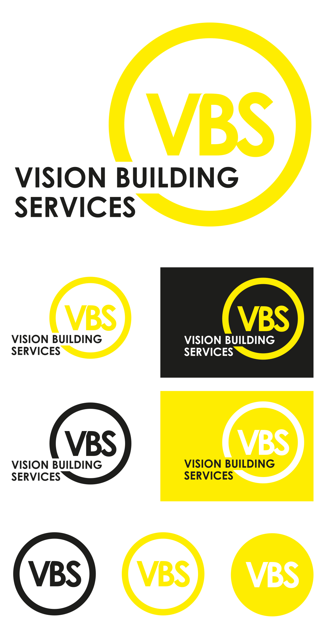
Ideation - Creating and styling new logo ideas into a final version
Once our Branding Discovery process was complete we began working up preferred logo ideas into workable solutions that could be applied into some final solutions.
We removed the 3 circles from the client's old logo combining them into one to simplify the logo and brought the 3 abbreviated letters closer together, also curving off the top part of the V to signify dynamism and forward thinking plus cut the angle of the V into the B to give the logo a contemporary touch.
We introduced a vibrant bright yellow into the client's logo to help contrast the black yet still complemented the new logo symbol. We retained the previous sans serif font, Century Gothic, to ensure there wasn't too much diversification from the client's original branding.
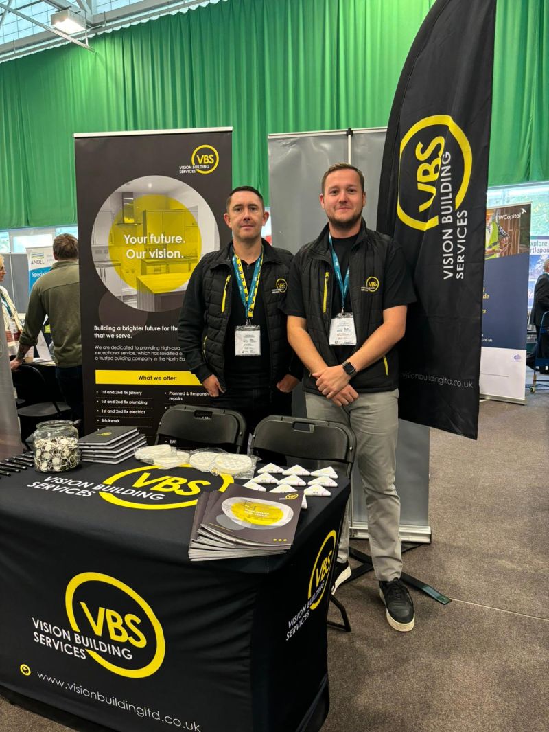
The strapline 'Your Future • Our Vision' was also adopted and used on associated marketing collateral including vehicle livery.