Recommended
How do different website platforms affect SEO?
Martin Pollock
When it comes to getting more visits to your website, SEO (Search Engine Optimisation) is one of, if not the best, things that you should consider.
It's a common trend to simplify a logo and brand. There have been plenty of examples with varying degrees of success in recent years. While it may work for some brands, others have fallen into the same trap often removing what made the brand identifiable or creating something simply forgettable as a result.
Going the opposite direction may seem riskier or going against a popular trend, but could prove to be a better option.
When less is just less
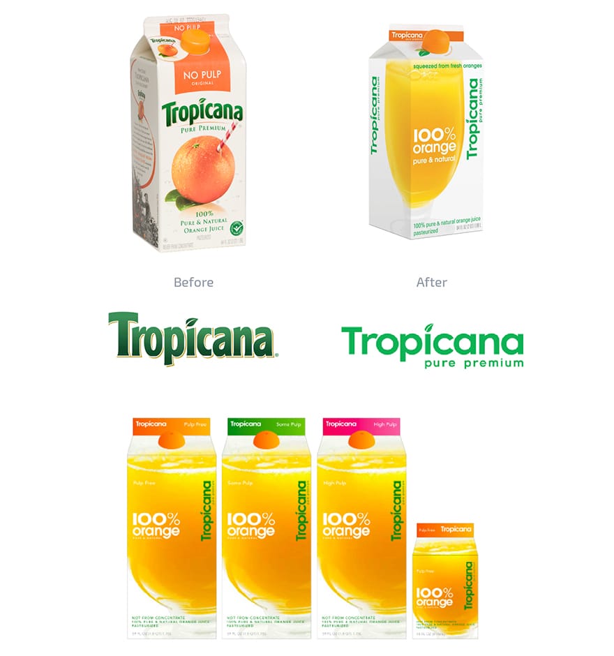
Tropicana made a drastic change to it's North American packaging after unveiling a brand refresh in 2009. At first glance the packaging looks much more contemporary but the logo received a modern redesign meaning it lost all its character. Their trademark fruit with a straw image was replaced with the most generic image of a glass of orange juice you could find.
It no longer looked like a Tropicana product, and any brand recognition consumers had was gone. The sudden change lead to a drop in sales by 20%, and the company hastily reverted back to their old packaging and logo in just a few months.
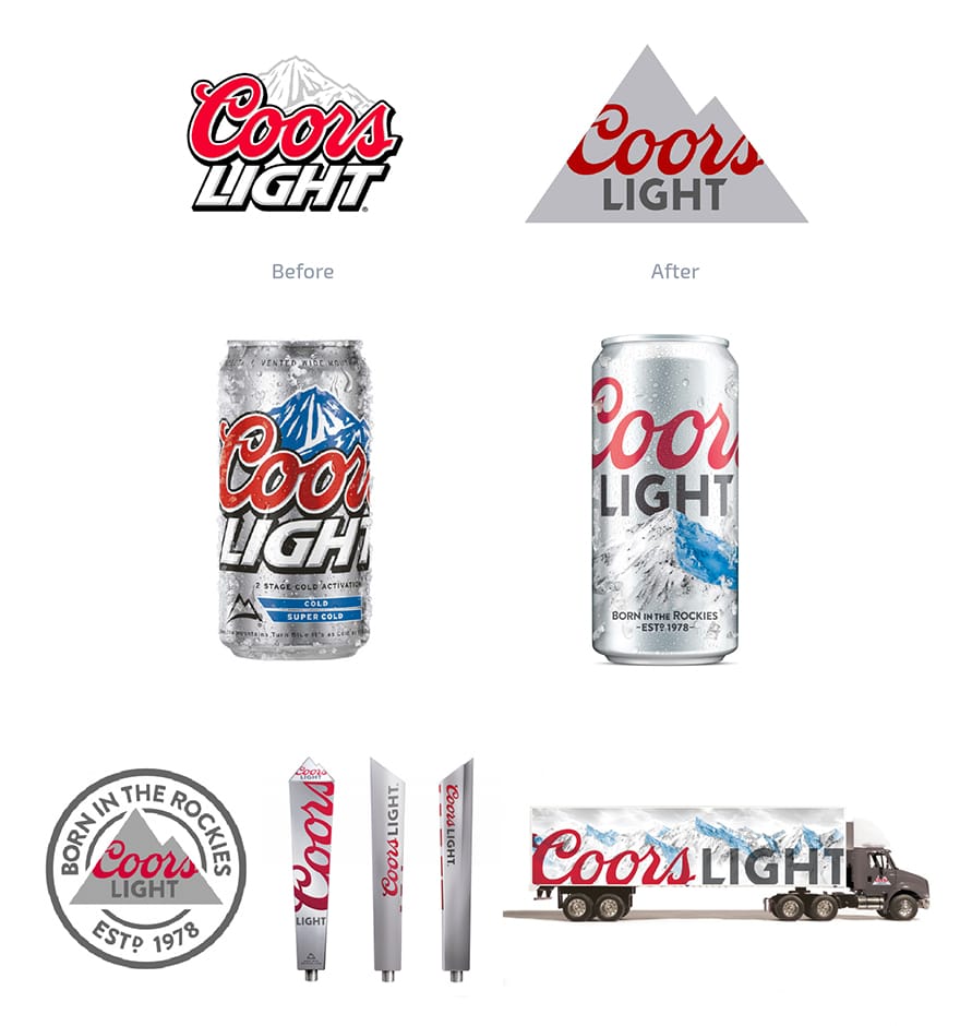
American light beer Coors Light launched a rebrand in 2015, and for the most part this was a welcome update. The Coors logo was stripped down to the recognisable red script, but the other elements of the branding were replaced with sans serif text and a flat mountain icon that was a dull grey. The packaging included photos of the mountain instead of the drawings, and the muted colours made the product less eye catching even though the design and layouts were great.
The rest of the brand was suitably modern and well executed, with the applications having a quality feel to them. But the simplified design and grey colour palette created a brand with a lot less presence.
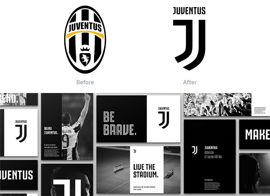
Juventus FC relaunched the club's crest and brand for the 2017 season by dropping the shield, crown and bull to create a simplified crest that only showed a J shape in black and white stripes.
Updating a sports teams badge rarely goes down well with fans, if Everton's rebrand is anything to go by. The response was polarising to say the least. The old logo didn't really need to be updated, as the design had slowly been evolving since 1905.
Instead, the club's aim was to create a more definitive identity like the New York Yankees. While it was a stylish rebrand, fans felt there was a loss of the club's heritage as a result.
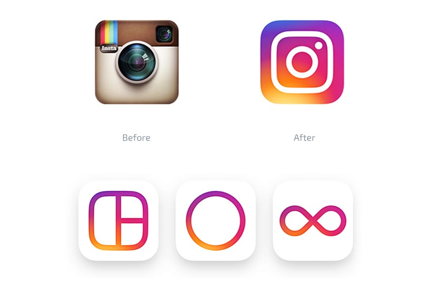
Instagram updated its logo in 2016 to a mixed reception (big surprise). The old branding used a retro camera that was synonymous with the name, but the new logo opted for a simplified camera icon that felt more generic. It could easily be confused for any camera app on a phone but the gradient at least made the app icon feel unique.
Originally known for it's retro filters, Instagram has since added a number of features and opted to move away from the skeuomorphic approach. It was a welcome update, but perhaps too generic for some.
When more is actually more
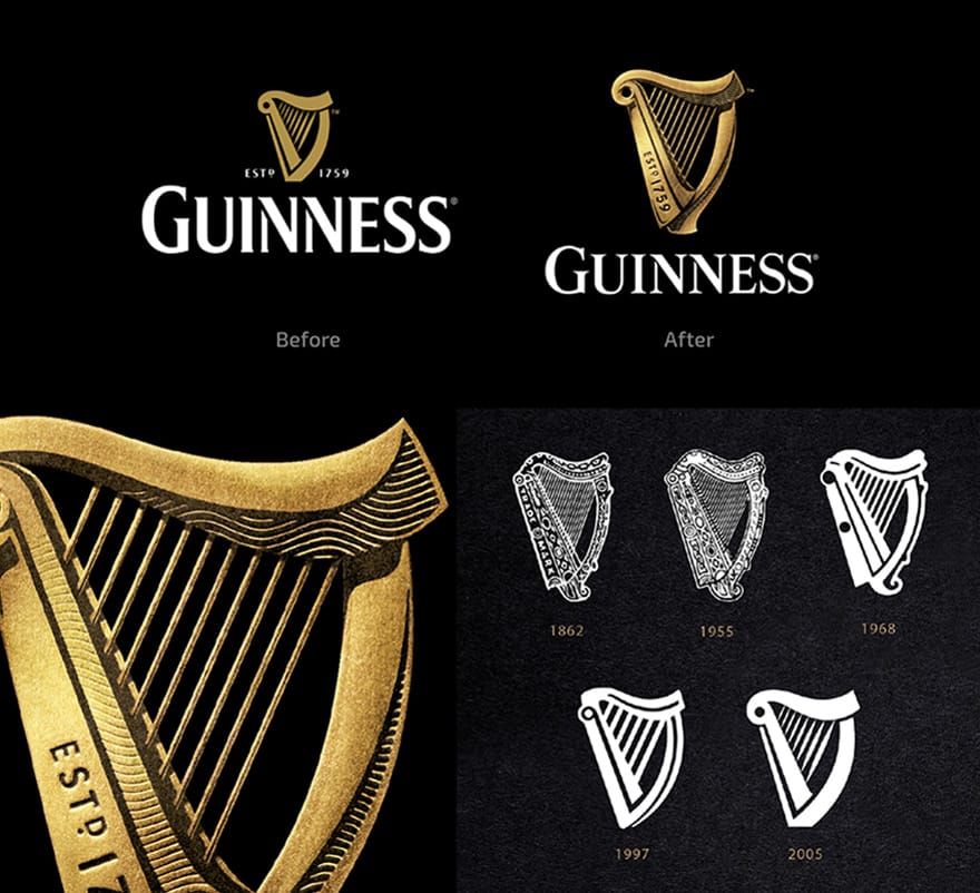
One of my personal favourite redesign in recent years. Over the companies lifetime, the Guinness logo had been getting simpler and simpler. The new logo featured a harp with a great attention to detail that included a metallic look and pattern. But it still retained the shape and proportions of the previous logo, while staying recognisable and in this case timeless.
What set the new logo apart was the attention to detail. The logo was designed in collaboration with British harp makers Niebisch & Tree. If the Guinness logo was a real life harp, it would work and even be in tune.
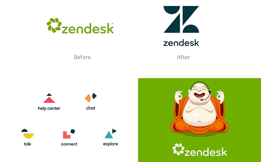
Zendesk moved away from it's boring logo and overly cheerful buddha mascot, in favour of a more abstract approach. The new Z icon was constructed from several shapes, that extends to the ambiguous icons for the companies services.
The approach left many scratching their heads, mostly due to the icons being fairly abstract. And you could argue the new move is anything but 'zen'. But in a world where every company in silicon valley employ very safe, lowercase text based logos, this feels like a company wanting to move away from the corporate identities of the competition.
The whole identity was undoubtedly fun, quirky and tongue in cheek as illustrated by the Zendesk's rebrand video. A risky move, but for me this really gives the brand a lot of personality.
And a few brands that went retro
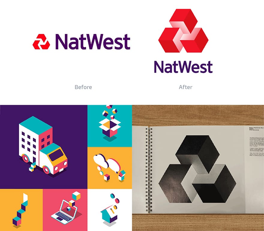
A good example of reviving an old look can be seen with Natwest's new logo that doubled down on the 3D. Reincorporating the three dimensional cubes and shading that had been removed back in 1969.
The new brand is complemented by 3D illustrations and typography that are overly colourful and cute. Although, the designs feel slightly off brand for a bank. But it takes the influence of the past and moves forward with a brand new style. The overall approach feels very different from other national banks, and despite being risky this is much more memorable.
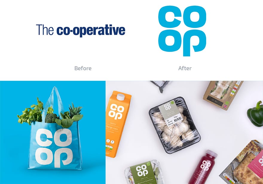
On the other hand, The Co-op revisits their logo from the 70s, but doesn't do anything all that new with it. The simple designs and product packaging are clean, and help to give the chain a stronger identity. The whole rebrand has been criticised for looking and feeling corporate, but the strong logo, colours and imagery make the brand feel much more modern.
It may seem like a risk to go in an odd direction or against the trend. But rebrands like Guinness, Zendesk and Natwest help to illustrate how a new approach can give a brand more presence and help to stick in consumers minds.
While backlash may be common for big rebrands these days since every twitter user thinks they are a graphic designer. In the long run the more ambitious but well executed updates can create a more memorable and long lasting brand.


Comments
No comments have been posted yet!