

Recommended
Agency Vs In-house
Hannah Draboczy
Are you fresh out of university looking for a job in the marketing industry? Or perhaps seeking a total career change into something more creative? Chances...
In the summer of 2016 I paid a visit to the great white north to visit some family. While I was there I began taking pictures of every piece of design I saw in Toronto. From corporate logos on the top of skyscrapers, to vintage typography on the side of a crumbling city house and rusted train cars.
In recent years I’ve been following a number of Canadian agencies such as Hulse&Durrell, lg2, Locomotion and Signal Noise. Lately, I’ve been reflecting on the logos and design I saw during my visit and decided to document my findings. I see this as a glimpse into a different culture’s and continent’s world of design. Brands that familiar to the locals but new and weird to an outsider.
So this is basically that, the culmination of a fascination with Canadian graphic design, and a camera with a 64GB memory card.
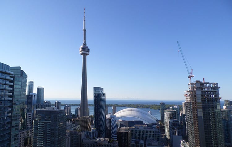
Room with a view
Our condo on the 40th floor on Peter Street had a superb view looking south over Lake Ontario, with a view to the East of Canada’s financial district and it’s fair share of corporate and banking logos.
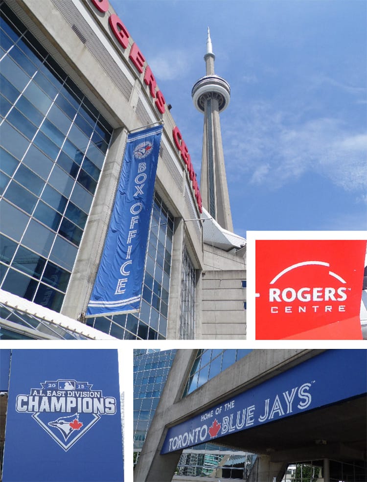
Home of the Blue Jays
South of our apartment was the Rogers Centre, a multi purpose stadium used by the local baseball team the Toronto Blue Jays. The branding had what I would call a north American sports look, but used a modern inline font and a bright blue colour scheme with the red maple leaf. The blue jay in the logo comes across as being very versatile, being used as a silhouette or in one of the several logo variations.
The Rogers Centre also had great logo, depicting a simplified version of the stadium’s retractable roof. Good hot dogs too.
It was interesting to see a brand like this first hand. Sports teams in the UK typically have one logo that is barely altered, or uses one composition. But here the brand feels more expressive with a variety of team wear and apparel that is free to experiment with the logo. Using different colours, type and layout.
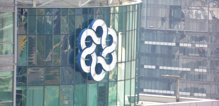
One of the most bizarre logos I could see from our apartment was the logo below. I took a walk to this building and found it was the Metro Hall building. Housing the senior level of municipal government in the city built in 1992, the logo itself doesn’t seem to have a date.
At first it looked rather sinister, like several rings or snakes linked together adorning the top of the headquarters of an evil corporation from a 1980s action movie. Unfortunately, I’ve not been able to find a proper explanation of the logo’s or it’s designer. But my best guess is that the circles could represent the number of districts in the city to symbolise unity. As the building itself was intended to combine all the councils of each district into one location.
Design Canada
There were a number of logos plastered on skyscrapers I could see from the apartment. Mostly banking and corporate logos, but some great ones. Including the logos for the Bank of Montreal, Canadian Broadcasting Company and dated looking CIBC.
The Canadian Broadcasting Company logo, seen bottom left, has become an icon in Canadian graphic design. The original concept for the logo dates back to 1974 but was refined in 1992to reduce the number of circular elements and the central ‘C’ was changed to the solid circle.
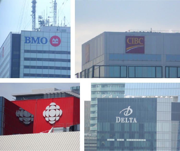
Other logos I found on my travels were the very clichéd Scotiabank logo. And the simple, stylised flag logo of the National Bank. Easily the most generic name for a bank I’ve ever seen.At this point it’s clear the most popular colour combinations were red and white.

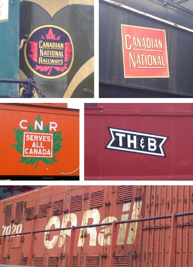
Canadian Network Rail
One of the most famous logos to come out of Canada was the Canadian Network Rail logo from 1959 designed by Allan Fleming. The best place to find this (I thought) was to visit the historic railyard in the shadow of the CN tower. Here I found plenty of vintage CanadianNetwork Rail logos but the closest I came to finding the logo was on a grey cap. But still, it made for a good souvenir. I also found the CN logo by the side of the railway tracks on our way to Humber Bay. Why it was there I have no idea.
![]()
Below are some old logos that the current CN logo replaced at the historic railyard. There were plenty of examples of vintage logos and typography, including some old train cars forCanadian Pacific Rail.
Travelling to a new country or city means you will be using public transport regularly. The UP logo below is used for the ultra modern Union Pearson Express which goes directly to the airport. The mark is fine on it’s own. But it was the overall brand, colour scheme and cheerful illustrations that helps to sell the logo.
The VIA and GO logos however really stood out to me. For the GO logo, the lines meeting in the ‘G’ could resemble that of an intersection or station, and the line moving away splitting the ‘O‘ in two.
While the VIA Rail Canada could resemble the portion of a railway track from above, where the tracks can be switched to redirect trains. Unfortunately, it’s accompanied by the name inTimes New Roman, a large maple leaf plonked on the right, and the full Canadian flag placed awkwardly on top of the ‘a’. Just in case you forgot which country you’re in. The fact the maple leaf appears twice is overkill and unnecessary.
![]()
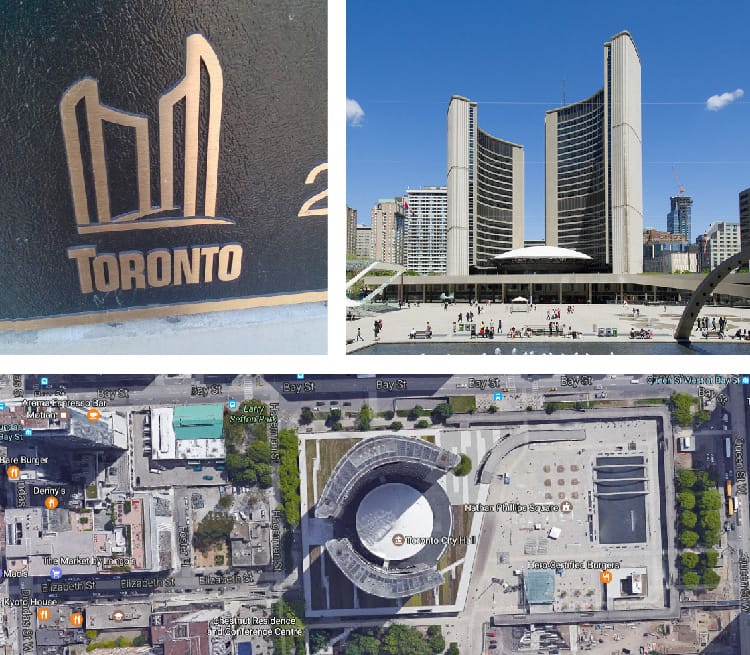
Eye of the Government
Another great logo that popped up regularly was the logo for the City of Toronto. Depicting at hick outlined version of the City Hall.
Designed by Finnish architect Viljo Revell, who died one year before it’s completion, the building was opened in 1965. Due it’s odd design and layout it’s one of Toronto most unique landmarks. It has since been nicknamed the ‘Eye of the Government’ as from a bird’s eye view the two curved skyscrapers and central dome resemble a large eye.
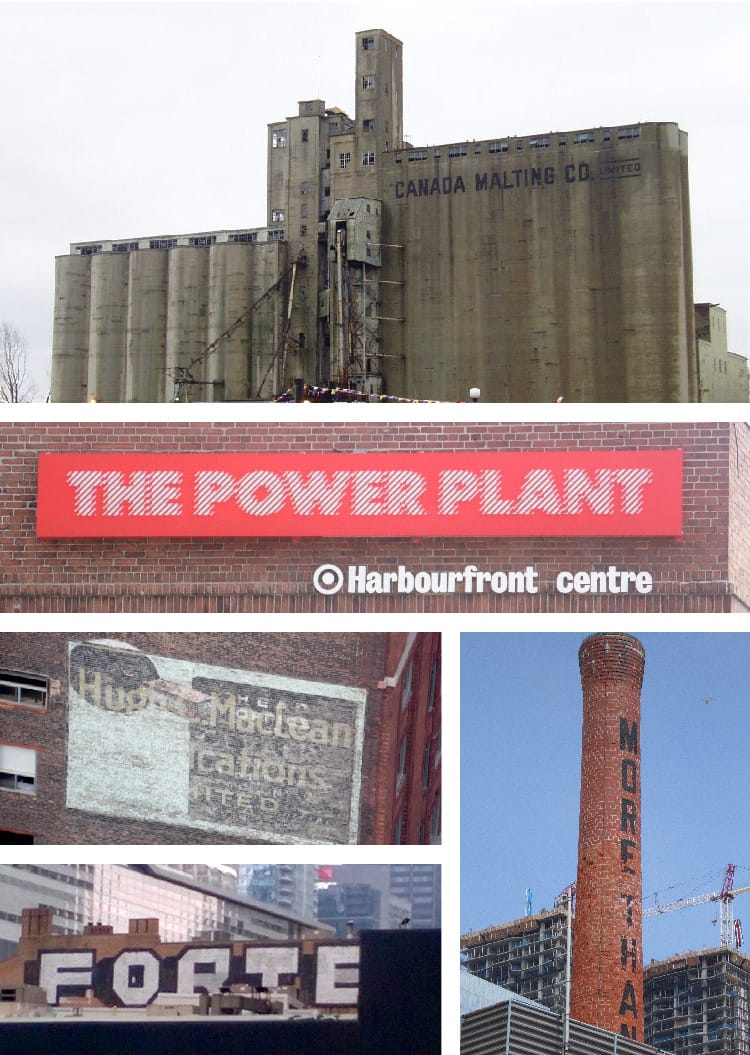
On our final day in Toronto I had one last look around to take some more pictures of logos and typography I had missed.
The most fascinating being the now abandoned industrial silos for the Canada Malting Co. The silos are a huge imposing brutalist structure that once stored malt. It was operational from1928 until 1987 and has remained derelict ever since. Various proposals have been put forward to renovate the structure to no avail, and it’s now a national heritage site.
Another old building that caught my eye was a contemporary art gallery called the PowerPlant with an eye catching distorted logo and typography adorning the chimney. The building functioned as an actual power plant from 1926 until 1980. With the first exhibition opened to the public in 1987.
Since I took too many photos to fit into one blog post, you can find more images of Toronto in my Flickr album. Including plenty of images of the weird graphics around the Roger’s Centre, and the railway museum. Click here to have a look.


Comments
No comments have been posted yet!