
Recommended
Want more enquiries in 2026? Start with these proven digital tactics
Dave Ramrekha
As we move into 2026, one thing is clear, the businesses that embrace digital innovation will be the ones that accelerate growth, strengthen their brand...
When I tried to think of the World Cup branding of my youth, my memory of the logos were far better than the actual logos. It's surprising just how many bad World Cup logos there are.
The Olympic games have this fantastic history of logos dating back to the 1930s. Including prestigious looking crests, abstract designs, minimalist logos, and custom typography. Some of which have become iconic.
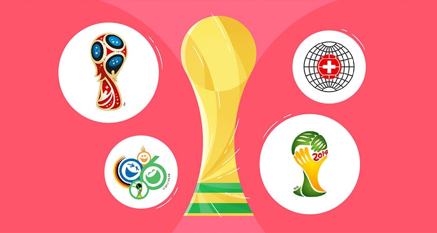
For most of the World Cup logos, they feel dated and often cheap. Giving the whole event a less prestigious quality. Times have changed in recent years as the World Cup branding has been given the same care and attention as the Olympic counterparts. But what are the best World Cup logos?
The Champions
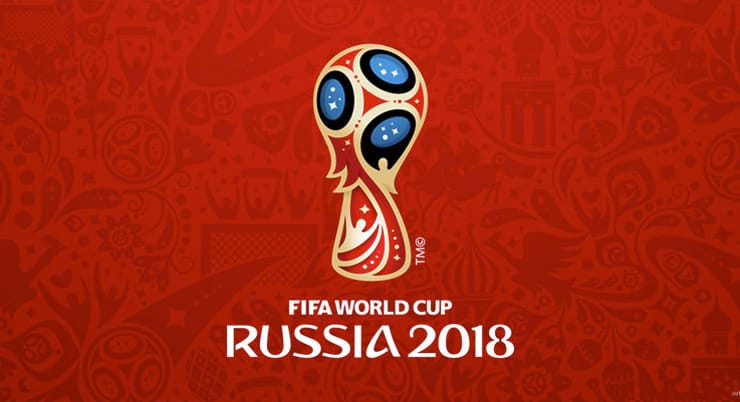
Russia 2018 Designed by Portuguese agency Brandia Digital, the Russian World Cup logo is both bizarre and fantastic. Resembling a Faberge Egg in the shape of the cup, the logo has a great attention to detail. Including some subtle hints to Russia's history with space travel and silhouetted figures celebrating. The logo works extremely well despite the typography feeling out of place, but it's complimented by some great iconography and on screen graphics.
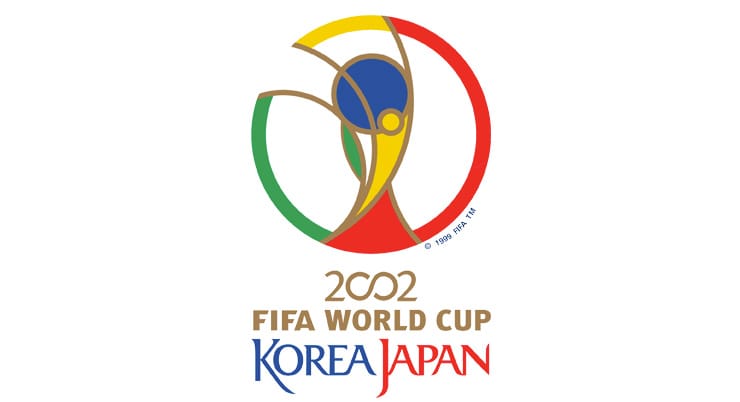
Korea Japan 2002 A simplified version of the World Cup that sheds the awful World Cup logos of the 1990s. The design is bending slightly too far back but the proportions and use of colour still create a great logo. Having said that, maybe it's the nostalgia that appeals to me on this one. This design would go on to be used in the following World Cup logos in one way or another.
Switzerland 1954 One of the few old logos that holds up today. The clean, sophisticated style is a trademark of Swiss design. Very few elements but very refined. The white cross in the red football works perfectly in front of the simplified globe. The logo works well on patches too, aside from the typography. You could argue it's quite formal feeling for a World Cup logo.

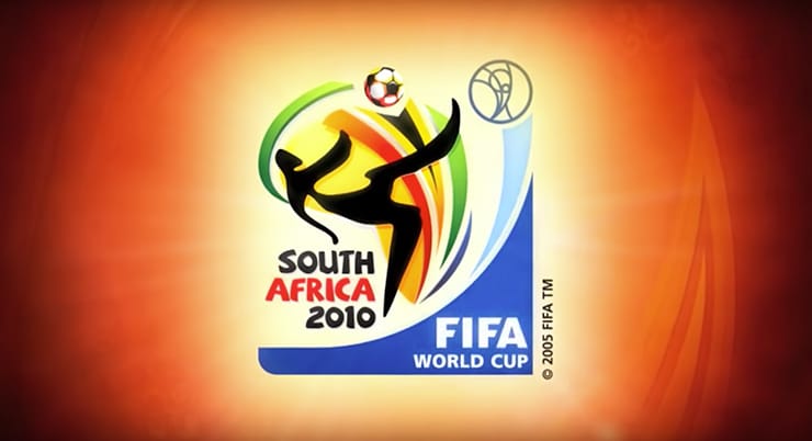
South Africa 2010 A great concept let down by some so-so execution, but still a decent logo. What I love is that the style feels African, resembling African tribal art as the figure attempts to do an overhead kick. The swooshes behind the ball use the colours of the South African flag which create the shape of the continent as a back drop.
What lets this down is the childish looking typography and an overuse of shadows. Not to mention the FIFA and 2002 logo added in a terrible, out place blue graphic.
The Losers
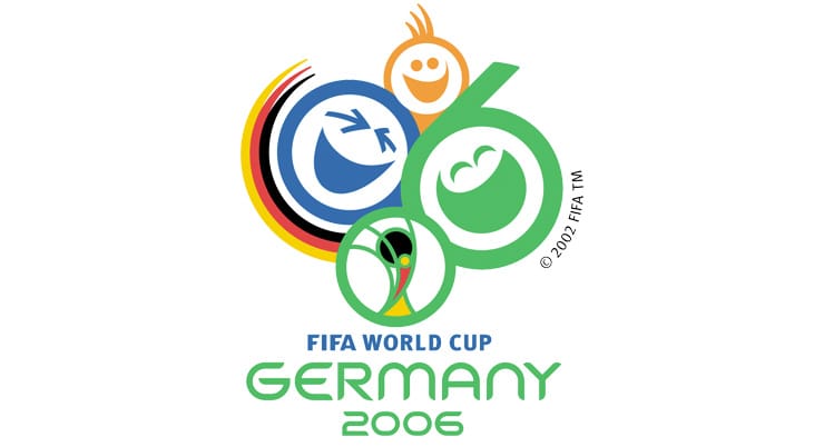
Germany 2006 I don't get this one, nothing works. 3 laughing faces with the 2002 logo shoved in below, but changed to green. It's difficult to know where to start...
Why does one of the most prestigious sports tournaments have such a childish logo? Why are there three 0s and one 6? Why green when the German colours are white and the flag is red, yellow and black? Why the orange and blue? Why is the flag in a swoosh?
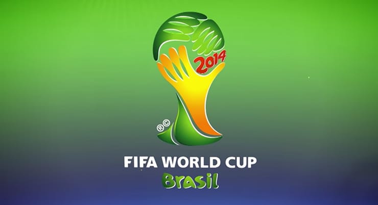
Brazil 2014 Easily the best concept with a disappointing execution. The trophy made out of clasping hands that could symbolise how the world cup can bring countries together in the name of sport.
The hands look like they were drawn by a toddler, as does the Brazil and 2014 text. The use of colour is good, but it has too much detail and garish looking gradients.This concept with some refinement would have been one of the greats.
Honourable mentions (sort of)
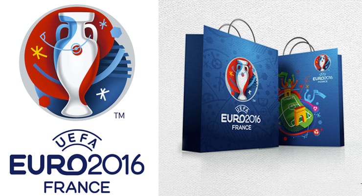
France 2016 Euros I think I just want a reason to talk about this logo despite it not being for the World Cup. The France 2016 logo does a great job at creating a unique style for the tournament, with an abstract but artsy look. Despite all the icons and some chaotic applications the whole brand feels fresh next to the other Euro brands. One criticism I do have is the whole identity doesn't exactly feel very French. But this style would go on to influence the Russian world cup and the identity for Euro 2020.
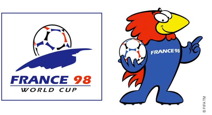
France 1998 This logo easily has the most nostalgic for me. But I much prefer Footix the mascot…
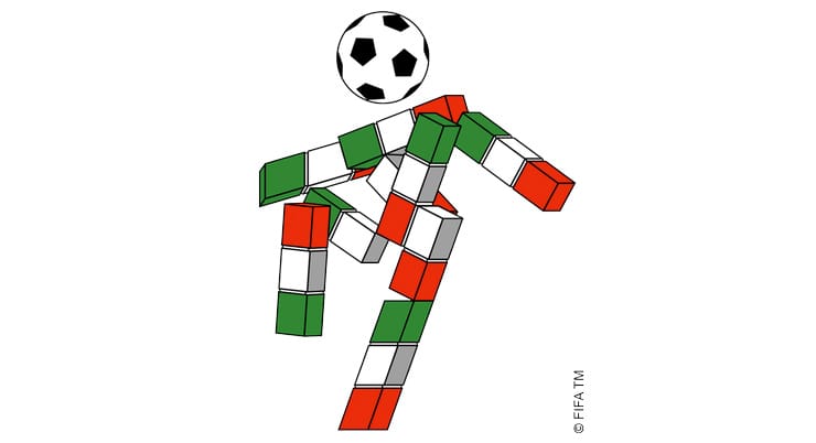
Italy 1990 mascot I think the ball is meant to be the mascots head, but either way this makes me laugh…


Comments
No comments have been posted yet!