

Recommended
Funding opportunity for young entrepreneurs in the Tees Valley, delivered with VIA Creative
Dave Ramrekha
At VIA Creative, we’re proud to help ambitious 18–30 year olds access funding and crucially, turn that funding into real, tangible business growth.
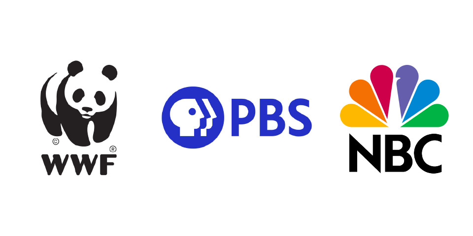
We come across logos every single day. They’re everywhere and used on (almost) everything. Many of us won’t even look twice at the design or consider what it means, apart from being a representation of the product or service. What we don’t realise is a lot of logos have far more to them than first meets the eye.
Negative space logos creatively utilise the blank, empty area around an image, letter or text to form a completely new image and create a logo which communicates on both a direct and subtle level.
Naturally, not all logos call for a design utilising negative space, but when they do there is a joy and outburst of creativity that go hand in hand.
So why use negative space in logo design?
- It’s engaging - the use of negative space often requires a viewer or consumer to really look at the design and to search for the “hidden” or subtle message; thereby drawing them towards your brand
- It makes your logo more memorable and unique - a negative space logo gets people thinking and talking. Having a unique flow, shape or twist helps you to stand out from the crowd.
- It can show off your creative flair - a fun, bold and balanced negative space logo design is a tried and tested way to show off your ability to think outside the box and create your own lane.
- It keeps things clean and simple - less is more, right? Negative space utilises what’s already on the page and helps to prevent your design from adding more and more, and ultimately becoming overcrowded.
Negative space can help your logo and brand by:
- communicating dual meanings
- creating visual puns or messages
- hiding deeper “hidden” messages and meaningful symbols
- put emphasis on different yet related elements
- create depth to your identity
- create unique shapes and symbols from organic properties of type, letters, shapes etc.
Different types of negative space in logo design
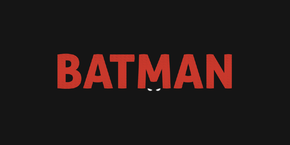
• A symbol within a symbol - sometimes known as a ‘Double Entendre’, this type of negative space combines two different shapes or forms to create a dual meaning behind a symbol - an optical illusion, if you will. Combining two separate ideas can be tricky but if executed correctly, you can sit back and enjoy your viewers attempting to find the hidden meaning behind your design.
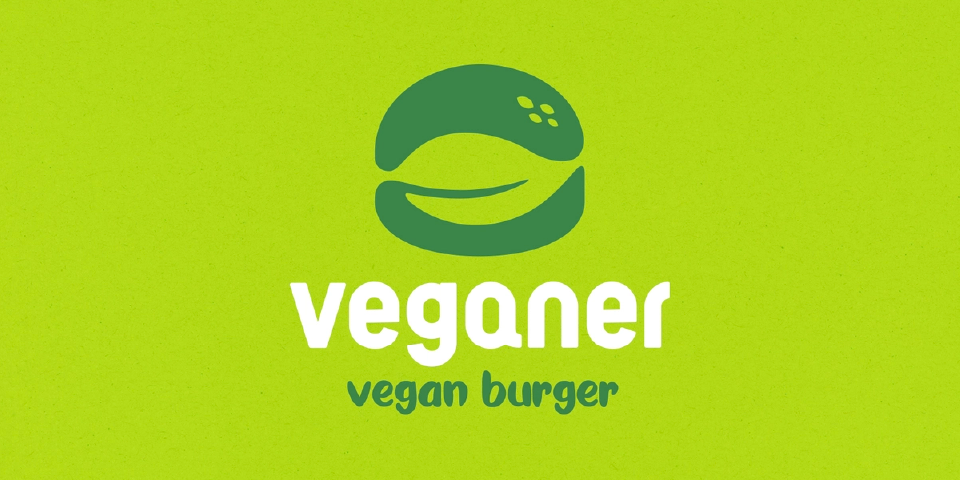
Credit: Veganer by Sava Stoic (dribbble)
• Hidden imagery - the logo design utilises the already existing negative space within the design to hide an image or symbol that adds a deeper meaning.
• In Wordmarks and Letterforms - making use of the negative space between different letters and areas enclosed within/between letters. You can also combine a symbol with a single letterform utilising the letter’s positive space by adding a symbol to the empty space inside or around it.
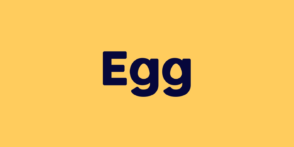
Credit: Egg by Leo (dribbble)
• From closure - the negative space combines with the positive space to create the appearance of a completed image. If that sounds a little confusing, take a look at the examples below:
Our tips for creating a negative space logo
There is no right or wrong way to go about it. Like any project, a designer will follow their own tried and tested process but hopefully these tips can help you along the way when designing a logo using negative space.
• Acknowledge and embrace the negative space from the start - consider how and why you’re going to be using the blank, empty space. Don’t use it as a border or constraint.
• Find shapes within the negative space - shapes are a logo designer’s best friend and they’re negative spaces’ too. Once you find a common, real-world shape within the negative space it will be much easier to utilise it.
• Overlap and subtract - overlapping objects are a great way to introduce and create negative space into your design. Consider two shapes overlapping one another. Let’s say a circle and triangle - the area where the two intersect will form your negative space. This introduces negative space without expanding or cluttering your design. Take a look at the example below for a better understanding of what we mean.
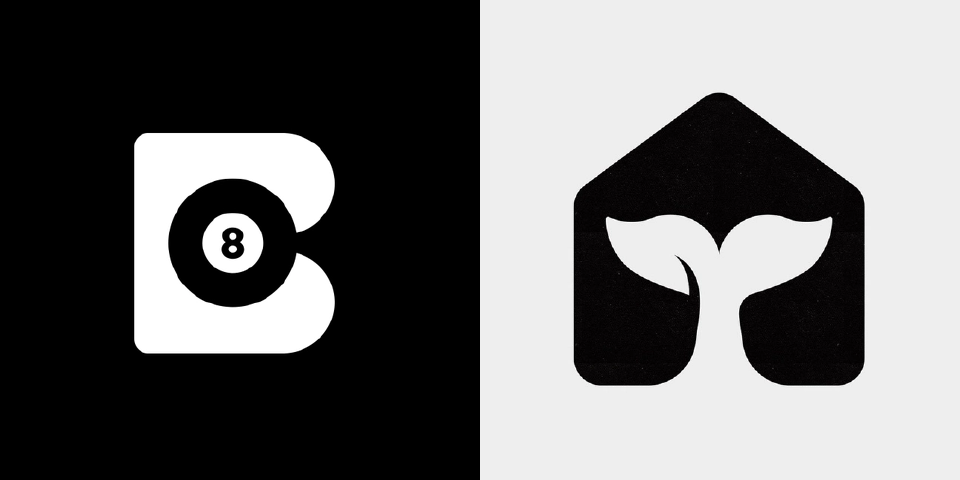
Credits: Billiards by Leo (dribbble) and Whale House 3 by Gert van Duinen (dribbble)
• Be mindful of the best way to deploy negative space in your design - every logo is different and will require a unique direction. Remember the different types of negative space use we mentioned above? Focus on which style is right for the particular logo design and brief you are working on.
Some of our favourite negative space logo designs
Here’s a small sample of the ever-growing list of VIA Creative’s favourite negative space logo designs:
and here’s some of our own negative space logo creations from over the years.
We’re not just pretty faces you know…

If you're interested in getting a new logo designed for your startup business or even getting your existing branding redeveloped, drop us a line to see how our creative services can help your business.
Call 01642 804534 or email studio@viacreative.co.uk


Comments
No comments have been posted yet!