
Recommended
Why design agencies shouldn’t be doing free creative work for branding pitches
Dave Ramrekha
Let’s talk about something that comes up far too often in our industry: free creative pitches. You know the format. “Show us some logo ideas.” “Give us...
Last year’s SEO statistics revealed that mobiles were the source of 52.2% of online traffic worldwide, up from 50.3% in 2017. This figure is only set to grow more on more each year. What’s more, it was found that a huge 51% of searchers are more likely to purchase from a website that’s been optimised for mobile than one that hasn’t.
Whether you’re an e-commerce start-up or a dog-sitting database, a cocktail-making blog or an estate agency, the figures clearly illustrate how making your website optimised for mobile is critical for business.
So what is ‘mobile-friendly’?
Making a website mobile optimised is not just about making it work on mobile; it’s about making it easy to navigate for users, giving them the same, if not better experience than they would from browsing your desktop website. Mobile users ‘need sites that work well on small screens, use touch controls, are easy to navigate, and load fast’ for a start. This is because they are either browsing on the go, or have a question that needs a solution pronto. If your website visitors cannot navigate your site easily on their mobile and struggle to find what they’re looking for, they’re just going to leave and go elsewhere.
The importance of mobile optimisation for SEO
Having a mobile-focused digital presence is also an important aspect of enhancing your Search Engine Optimisation (SEO) strategy. SEO is the practice of setting up your website using every tool available to promote it in organic search results.
Already, 69% of all digital media time is spent on a mobile device. In 2020, the number of smartphone users worldwide is projected to reach a whopping 2.87 billion; that’s up from 2.1 billion in 2016. You can see the pattern; mobile use is growing every year and is already a significant part of your target market.
Say you own an e-commerce store; did you know that 66% of e-commerce time takes place on smartphones? 51% of searchers are more likely to purchase from a website that’s been optimised for mobile, so ignoring mobile optimisation means you’re ignoring a huge slice of your target market.
With bespoke websites built from scratch like the ones designed at Via Creative, you have complete control over every aspect of your site from the ground up. This way, every method available to optimise the SEO of your website can be used to your advantage. Find out more about how different website platforms affect SEO from our own front end developer Martin Pollock here.
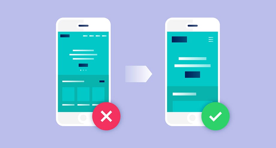
The solution: responsive design
‘Responsive design is the foundation of a mobile-friendly website’. We have all stumbled across a website that hasn’t been optimised for mobile, and found an awkward, tiny version of a desktop site, and scrolled across, back, up and down until it gets so frustrating, you abandon mission.
A responsive website design automatically displays your site properly on whatever type of device a visitor is using. At VIA, when creating bespoke websites we focus on the end-user and test our websites on every device to ensure whatever device is used, website visitors are there to stay and will come back again and again.
We take the device testing stage of our website building seriously, and any new site is thoroughly browser tested with a full quality assessment applied covering the infrastructure design and setup. We also deploy a staging link to allow you to view the site on a locked down domain so it can be thoroughly examined by you before going live. Find out more about the process here, and get in touch with the team here to see how we can make you a custom, mobile-led website.
So, take a look at your website on a few different devices and see how it looks. Need some help on getting your website mobile-friendly? Get in touch today to see how we can recharge your digital presence.


Comments
No comments have been posted yet!