Your Voucher Book provides a wide range of dining, leisure and beauty 2 for 1 discount vouchers. This case study demonstrates how we took the printed book and complemented it with a fully bespoke, custom made, native app.


Please choose from one of our services, fill in your contact info and we'll be in touch as soon as we can.
Having worked with the client for a number of years on their printed voucher book, we were tasked with transforming the client's service offering by creating and developing a fully bespoke native app as well as a brand new, mobile responsive website to process orders for both the printed book and mobile app.
The client undertook our unique project discovery process which helped us shape their mobile app project to ensure a clear and consistent customer user experience (UX) journey through the app. Our knowledge in UX and user interface (UI) design allowed us to process a clear path in how Your Voucher Book users engaged with the app functionality.
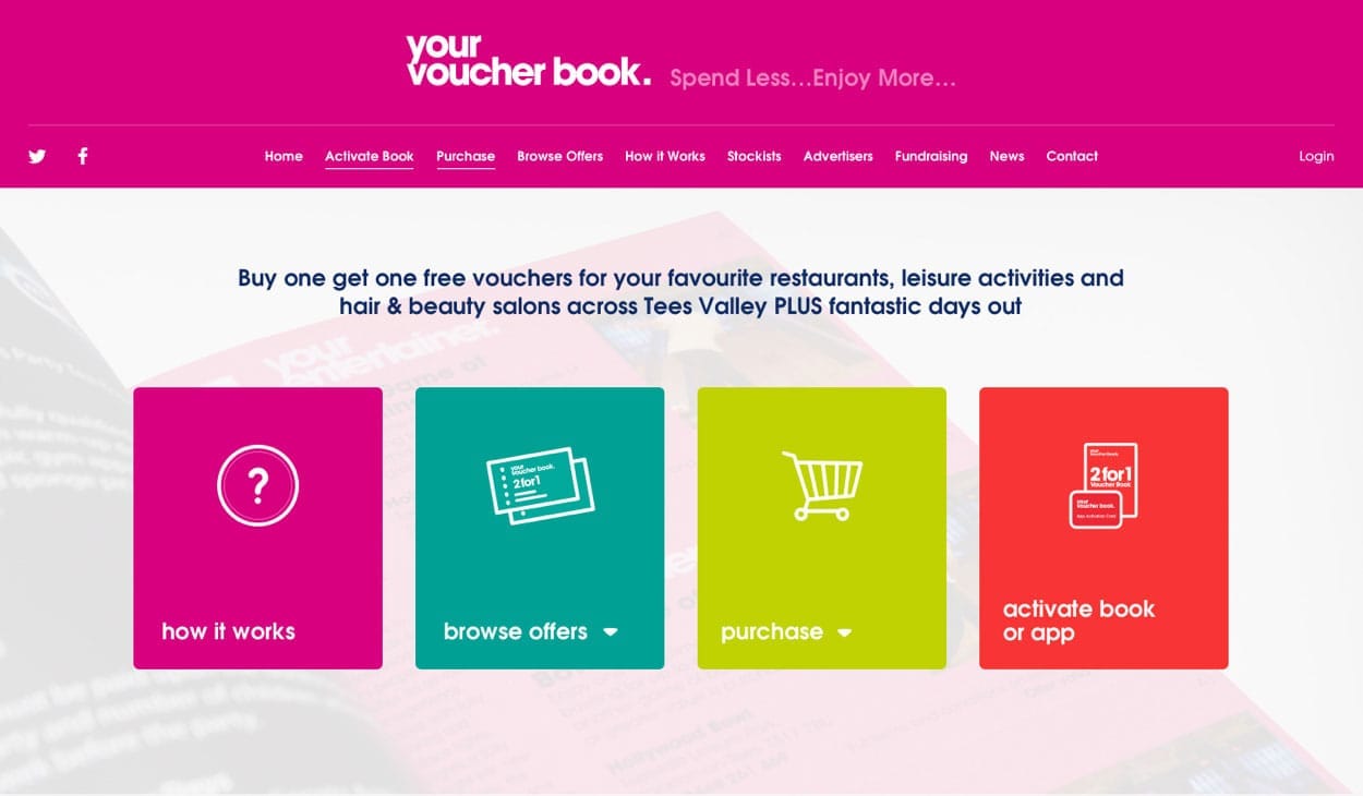
During the early stages of design, we went through an in-depth wireframing and prototyping phase to determine the user flow of the app. This resulted in muliple iterations of the wireframes as they needed to be finalised before moving onto the design phase.
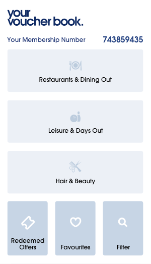
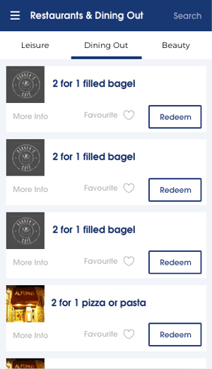
The layout would need to mimic the book in some ways, such as using tabs for users to flick between the 3 categories.

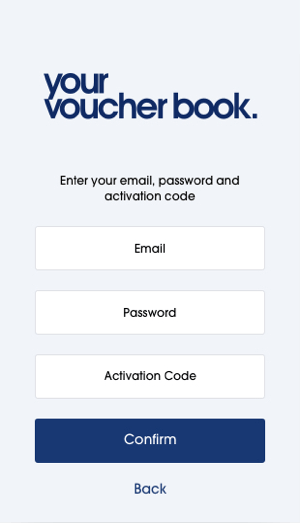
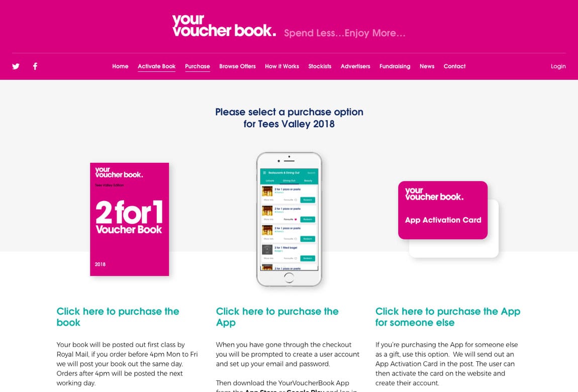
To get access to a year's worth of offers, users will need to purchase an app subscription. This is done through the website where their account will also be set up in the process.
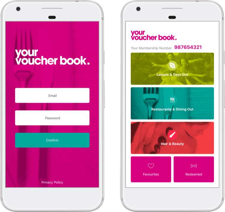
Once the subscription is set up via the website, the user can log in to the app.
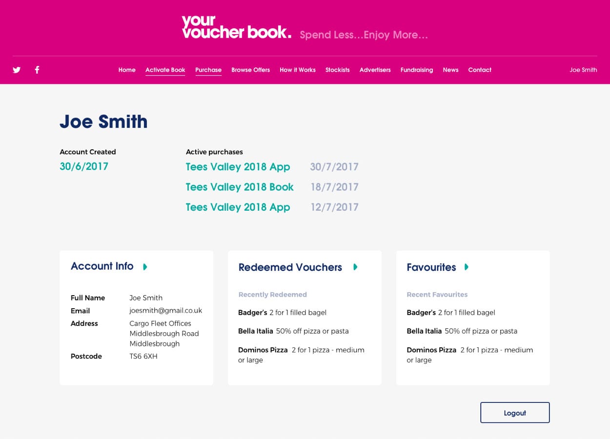
The app offers a number of advantages over the book, such as the redeemed and favourites pages which is automatically synchronised between the app and the website. Therefore, any vouchers favourited on the website will instantly appear on the "favourites" section of the app (and vice versa).
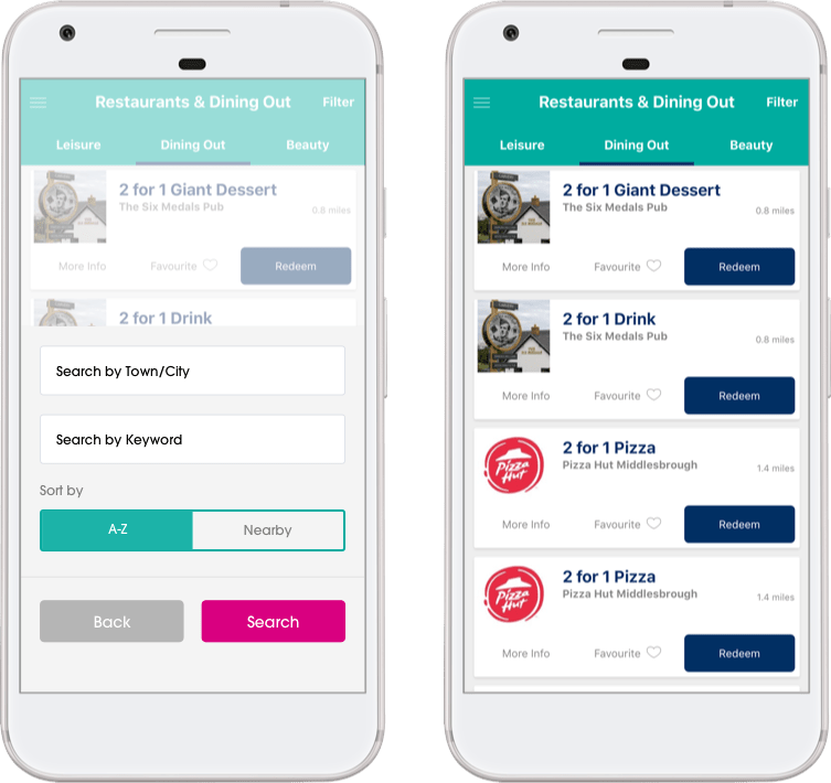
Another unique advantage of using the app is the filter and keyword search.
Allowing users to filter by a location or town, as well as sort by the vouchers nearest to you using geolocation technologies. This can be easily accessed at any time on the full vouchers list.
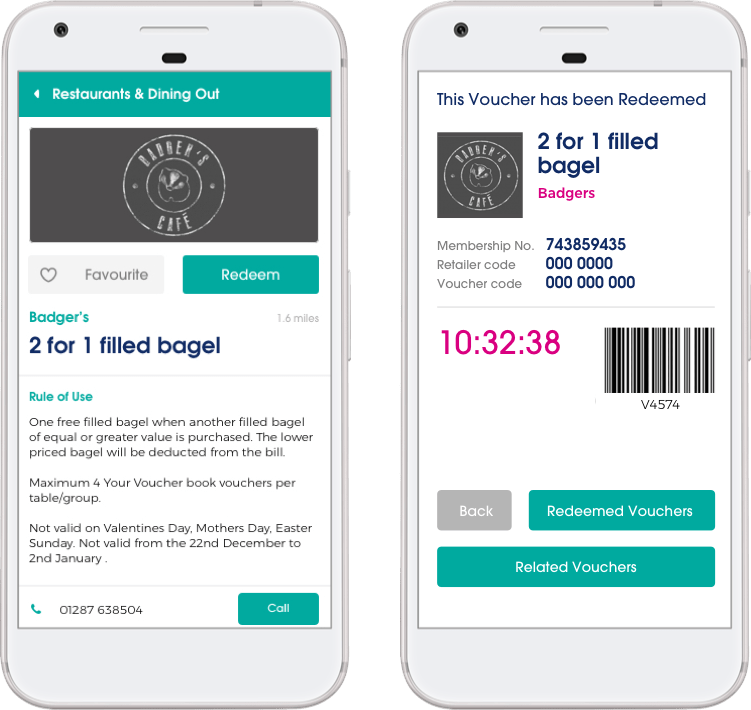
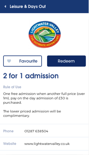
Each offer has an-in depth information screen. Providing info, rules of use, retailer contact details and its location.
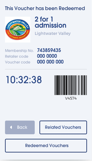
Once the voucher is redeemed, users can view the related vouchers from the same retailer, so multiple vouchers can effectively be redeemed at once.
The all new accounts section of the website allows users to view their past and present subscriptions, update their account and manage their favourited vouchers.
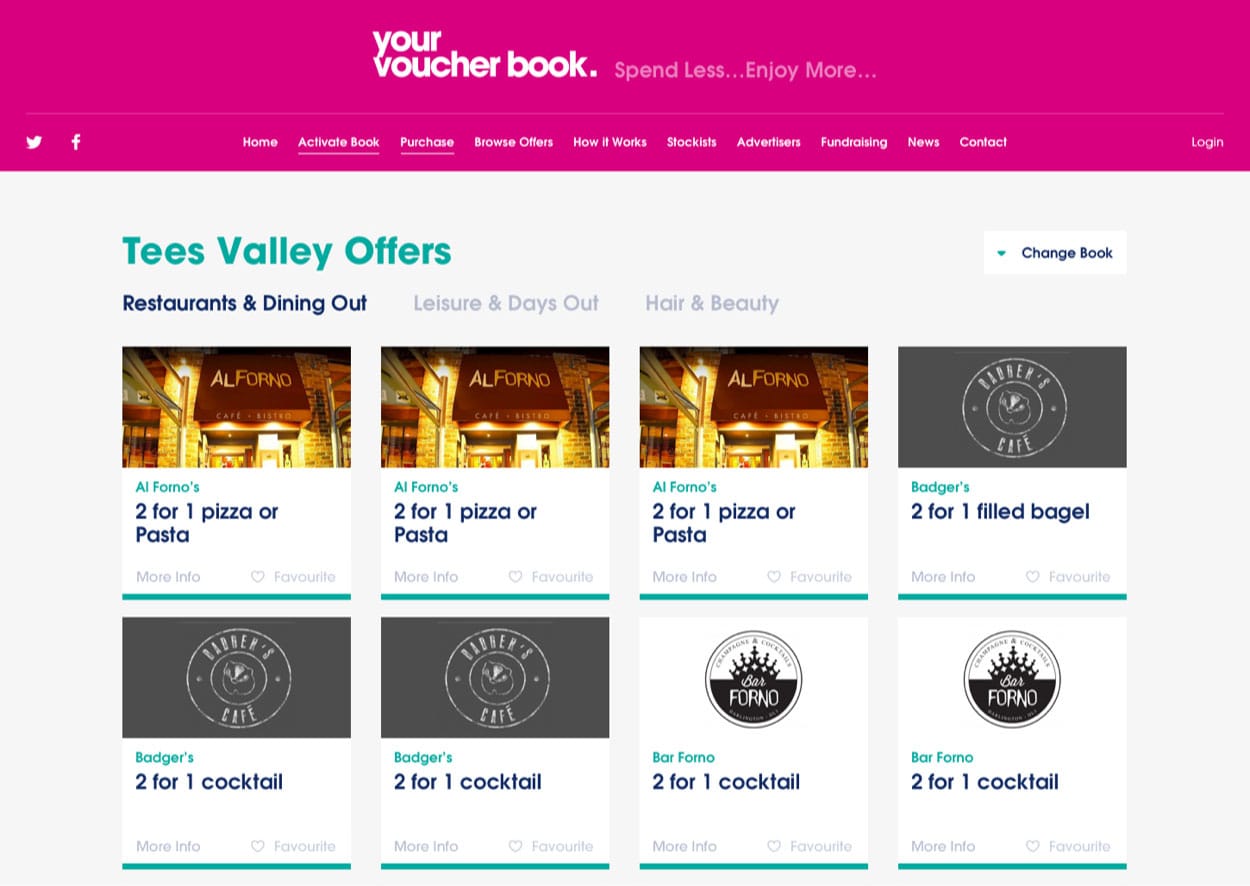
The website includes a fully redesigned offers page which is synced with your account and the app. Any vouchers you favourite on the website will appear on the app automatically.
At VIA, we only settle for the best. That’s why we provide truly native mobile applications. Rather than taking the quickest solution and building what's known as a "hybrid" app (which are notoriously slow and clunky), we build our apps from scratch with great attention to detail, and with future extensibility in mind.
Thanks to our native approach to mobile applications, our apps are always fast, quick and easy to navigate, and highly future-proof. Additionally, we design and build our UI for both the iOS and Android platforms separately as we don't believe in a "one size fits all" methodology.
If you wish to learn more about the differences between hybrid and native mobile applications, check out Terry's recent blog post: Hybrid vs. Native Mobile Applications
If you have a potential project that we could help you with, please fill out the form below with the information and we'll get back to you.