
Recommended
2020 is coming, time to make a plan!
Lee Woolams
It’s the time of the year when it quickly turns wintery, the big coats are out, and reflections begin on the past year. We also dream about what 2020...
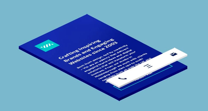
With the launch of the new VIA website (finally), one aspect of the design that received an unusual amount of attention was the mobile menu and it’s interface. A relatively simple idea that I’ve had in the deep recesses of my mind for several years now, stemmed from years of using two conflicting UI. I’ve decided to break down the method to the madness.
The Ideas
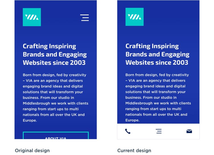
The menu in question is the mobile menu that appears on the new VIA website. The original placement of the icon was the more traditional top right to accompany the VIA logo on the left. But this icon was then moved to a dedicated navigation bar that appears at the bottom of every page on the mobile website.
The advantage to this approach keeps the buttons and interactions in the bottom half of the screen, resulting in less overreaching and stretching (and hopefully dropping) while holding your phone in one hand. In the past I’ve pitched this to a client while I has a freelance app designer, but was overlooked in favour of using flat UI.
This idea carries over to the menu itself. One of the old designs spaced out all the links evenly up the screen, but was later changed so the links sit towards the bottom right of the screen (as shown below).
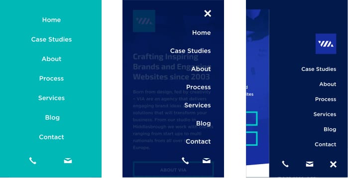
Motivation
Lately I’ve designed a fair few mobile websites but they all started to blend together. As my previous projects had included brochure websites, and as such lots of categories, which meant lists within lists within lists. With so many links it was difficult to think of a way to make them unique as well as user friendly.
Another motivation behind this approach comes from several years of daily interaction with a Windows phone and an iPod Touch.
On the Windows phone UI the majority of interactions and links are kept in the bottom half of the screen. To accommodate more interactions, the UI makes use of swiping to switch between the categories. For example, in a music app if you need to switch between artists, albums, songs you swipe left and right between them.
Compare this to the music app on iOS, which has a more clunkier dropdown. But it’s also placed in the top half of the screen. Which is manageable for a iPhone 5 size screen, but less suitable for the 6 and 6 Plus.
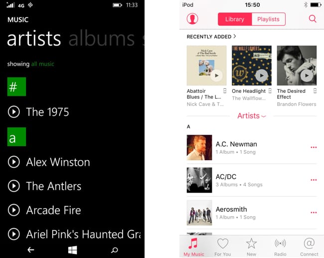
There are pros and cons to each design of course. On Windows you need to swipe a few times to get to some of the categories, but you don’t need to tap a specific button on the page so it makes better use of the touch screen. On iOS, you are presented with more options but you can only access the menu while on the main screen of the music app.
This is a personal preference of mine that I’ve used in the new website, and there are plenty of arguments for putting the menu icon at the top of the page as it is the second thing you will see after the page loads (as well as being the most common place for it). Part of this approach comes down to actually using the device in different contexts, mostly with one hand.
But it just goes to show that there can be a dozen solutions to one problem. You just need to choose the right one for you.


Comments
Carlos Peña
9 years ago
Hi Simon!
I feel the same about the menu/burger icon and the respective positions in any website.
I read your article and I like a lot.
I remember the position for some news websites and the UI applied in Windows Phone's interface, that's more effective and confortable for hand movements.
Greetings and i mark your site and follow your blog.
Ravi Joon
9 years ago
you have been amazing, very well adopted the approach