
Recommended
A thriving start to 2025: VIA Creative’s Quarter 1 Roundup
Dave Ramrekha
It's been such an exceptionally busy first quarter of 2025 for us here at VIA Creative. Our commitment to delivering innovative and impactful solutions...
I had barely touched a mac until university, since then every designer or creative you meet has a mac. My bias towards apple products has largely been the same until recently when I was looking to upgrade my 2013 MacBook. The laptop I went for was Microsoft’s own Surface Book. An ultrabook (I hate that name) with a detachable touch screen that functions as a tablet.
The concept itself is relatively unique and offers a ton of options that other laptops don’t have. At first I thought a laptop with a touchscreen was just a gimmick, but here the touchscreen works brilliantly for drawing and digital painting. With the screen detached it functions just like a tablet as it has it's own built in CPU, battery, lock button and volume controls.
What’s most impressive to me is how easily the interface transitions between desktop and tablet. The Windows 10 interface barely changes.
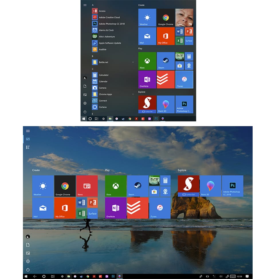
Windows 8 was Microsoft’s attempt at creating a two in one OS that worked with touch and mouse, but double downed too much on designing it for a tablet. So familiar features such as the start menu were replaced with a full screen interface that looked straight out of a windows phone. It wasn’t long until Microsoft brought back the typical start menu due to user complaints. Windows 10 instead has a start menu which is a hybrid of the two, while the tablet version is the same as the windows 8 version.
On windows 10 a lot of the controls, buttons and links feel big and clearly defined with rectangular boxes around them whenever you make an input. Some programmes like Microsoft Edge have clearly been designed to work seamlessly with a touch screen, as all the controls feel large. Despite the new design, it's still not my browser of choice.
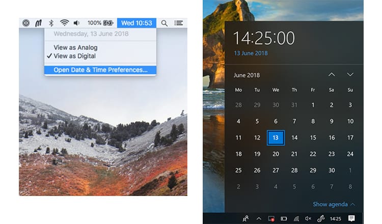
Another example of this approach can be seen when you select the date and time. On a Mac OS, to view the calendar you would need to select the clock, then open the preferences to bring up the window. On Windows 10 the calendar opens just by selecting the time, and the rollover effect means each day feels clearly defined. This approach has been applied across the OS. The downside is that non Microsoft programmes on Windows don't follow this approach. Google Chrome and iTunes for example have very small buttons and icons that aren't ideal for touch controls.
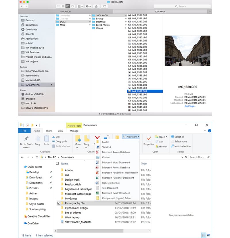
An area that could benefit from a redesign for tablet would be the explorer. The interface has all the hallmarks of some of Microsoft’s confusing UI designs. Lots of controls crammed into a small space, tiny icons, links at the top, bottom, left and right of the window. All the folders and files feel very small, while selecting multiple files at once is clearly not designed with touch controls in mind. Every file and folder has a tick box next to it, so one tap selects the folder while two taps opens the folder. A layout similar to Macs multiple column layout for the finder would be ideal for tablet.
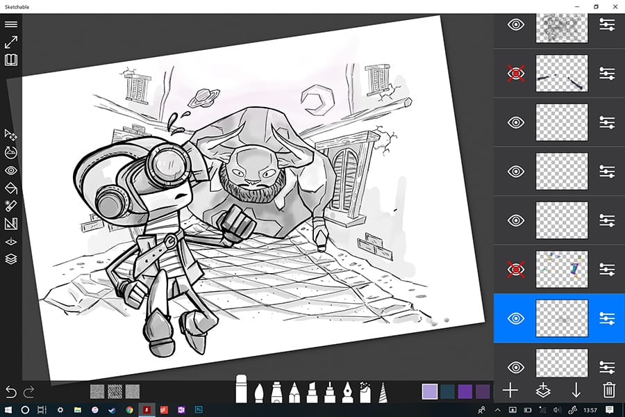
One of the primary reasons I went for a laptop with a touchscreen was using it for digital painting. Adobe programmes such as Photoshop and Illustrator are desktop programmes with touch controls added to fit the tablet interface. So their implementation feels unintuitive, as commands such as undo don't have an onscreen shortcut. Although Adobe have created the likes of Adobe Draw designed from the ground up for tablets, there are plenty of alternatives such as Autodesk Sketchbook and Sketchable (pictured below) that cater to touch controls.
The tablet experience is great overall. The touch controls feel very responsive and suitable for playing games. The screen as a unit does feel heavier than on other laptops as it has it's own battery and CPU. The headphone port is on the top right of the screen which takes a few days to get used to.
One of the reasons to purchase a Mac is they could run programmes better, particularly Adobe’s. But in the last few years not much has changed for Apple. They have been releasing gradual updates each year to their products while releasing more versions of already existing products. Such as cheaper iPhones, an even higher priced iMac, and a new MacBook alongside the MacBook pro and MacBook Air. Making the range even more confusing.
The new MacBook Pro with the gimmicky touch bar and lack of USB ports really put me off. But why would I spend the same amount of money on a new MacBook pro when I get less compared other laptops?
Microsoft has made a push for creatives in recent years. Which can be seen in their products like the Surface pro tablets and Surface Studio. An iMac competitor with a touchscreen that works like a large digital canvas. While future products like HoloLens aim tap into the frontier of augmented reality. It’s not all peachy for Microsoft, but I appreciate the ambition to try new things.


Comments
No comments have been posted yet!