
Recommended
The Great Email Bake Off
Ray Shephardson
Creating an effective email campaign is very much like baking a cake. If you have the right ingredients and add the correct amount of each of them, you...
Updating your logo can be a daunting task. Especially if you have an established audience and brand that have known you for years. The safest option would be to stick with it. But there can be a number of ways to approach it and move forward with a modern rebrand. I've looked at a few huge, well known companies in the examples below. But many of the lessons here can be applied across businesses of all shapes and sizes.
Change of business direction
A new brand could be a sign of a fresh start and looking to the future. This may include shifting focus to a new product or an area of the market.
Microsoft's shift towards mobile and tablet for Windows 8 came with a new logo and colourful rebrand in 2012. The brand followed Microsoft's Metro UI guidelines that had been implemented on its mobile device, which would be used as the basis for its rebrand. The whole rebrand felt like Microsoft was looking to unite all their divisions under one style similar to that of Apple. The PC, software, mobile and gaming brands would go on to have the same look.
![]()
To target a new audience
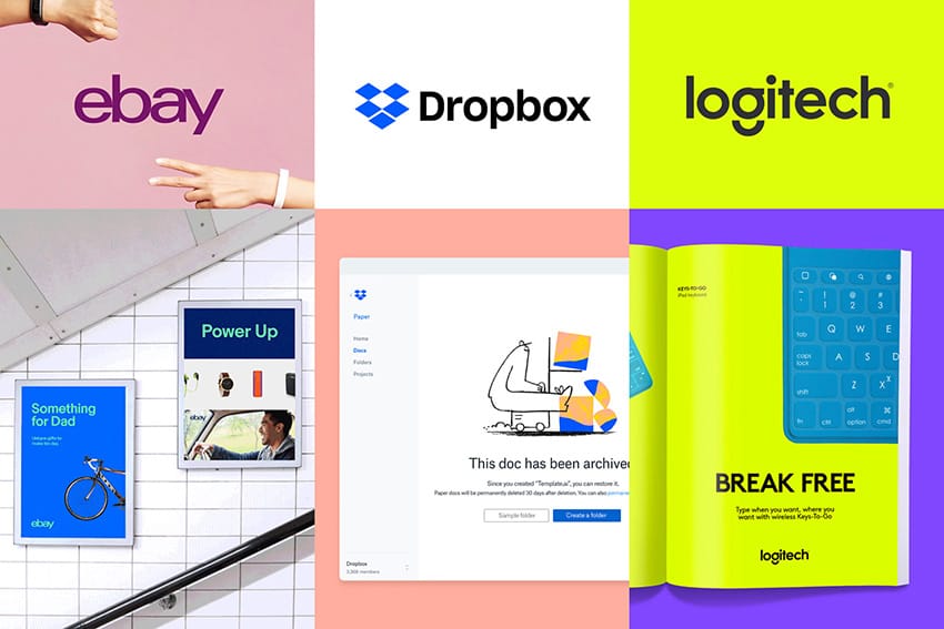
Your logo says a lot about your business but a rebrand can help to attract a new audience. It's common to apply a bright colour palette and imagery to appeal to a younger crowd which can be seen in the rebrands for Ebay, Dropbox and Logitech.
Each company implemented a new colour palette with new imagery and illustrations. The results varied. While this was appropriate for Ebay due to the variety of stuff for sale on its platform, Dropbox's approach was quirky but quite random.
Build a brand with a greater reach
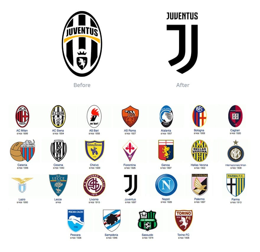
In crowded markets, the safer option is to follow what's popular or what the market dictates. Simplifying a logo has been a popular trend in the last few years as seen with Juventus' rebrand.
In 2016, Juventus' new logo was a massive departure from the previous crest. The logo removed many of the elements that had been used for decades resulting in a crest that didn't look or feel like a sports team. This new direction aimed to establish the Juventus name as a brand outside of the sport, similar to that of the New York Yankees. This was backed up by the marketing and launch event that looked more like something designed for Armani than a football team.
The brand feels old and outdated
A logo can quickly look dated in a matter of years if you decide to follow a design trend. Some brands never update their logo due to its timeless design, while others may go for a rebrand at the drop of a hat.
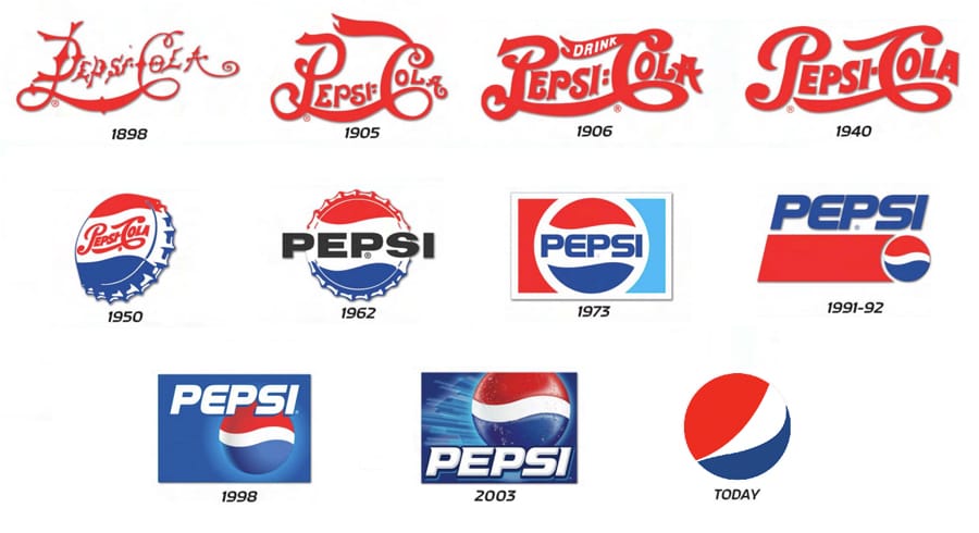
Pepsi has been updating its logo regularly since the late 1800s. The updates usually fall in line with what's popular at the time, so the icon and font would change according to the time period. The original was a vintage (but ugly) script, which evolved over the next few decades. Before applying it to a bottle cap in the 50s, until the script was dropped and a boring word mark replaced it. Followed by a variety of redesigns which gives the impression that Pepsi don't even know what their brand was anymore.
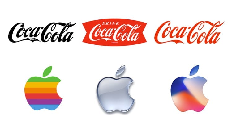
Coca Cola has kept the same word mark since 1905, while tweaking the look and updating the effects and background. The Coca Cola logo works in most instances and feels timeless, it's not chasing the market with update after update. Apple is another example that was kept the same distinctive logo since 1977 but updated the style due to its versatility.
There was never a defined brand or style
A new logo is usually accompanied by a full rebrand, style guide, defined audience, marketing strategy etc etc. But this hasn't always been the case. A logo may come first but the brand can be defined later. In some cases the brand style may never even be defined.
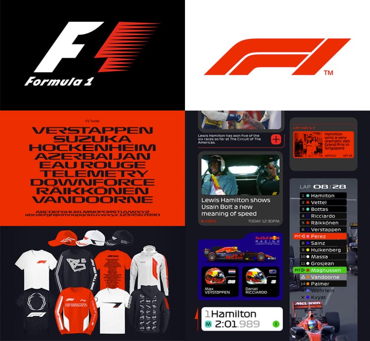
An example of this is the Formula 1 logo which was beloved by fans. The new logo may have resulted in a mixed response from fans, but the brand felt much more unified. With a unique font, distinctive colour scheme and bespoke graphics used during the race broadcasts. When brand was revealed, the new style was applied to clothing and other merchandise too.
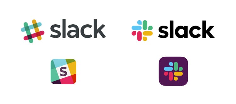
Slack's rebrand saw the company drop the established hashtag logo. The previous logo was familiar to many, but was made when the company was only a start up. The logo was at an awkward angle and difficult to work with due to its colours. The brand was updated over the years but the latest rebrand feels like a fresh start and it's a lot more versatile.
There can be any number of reasons to update an established logo and a number of reasons not to as well. Your logo may feel outdated, you're moving into a new market or there could be a new product to launch or audience to reach. To get the best results, it's important to keep an end goal in mind and ask the right questions right from the start.


Comments
No comments have been posted yet!