Recommended
Why You Need to Think About Reinvigorating Your Website
Ray Shephardson
A website redesign can be a daunting task for your business, but by making sure you are partnering with a good web design firm (like us) can make the process...
We’re currently celebrating our 16th birthday! I know, 16 years of trading in a very competitive market is certainly impressive but it got me thinking about some of the original design work we produced going back to the early days of VIA Creative and way before our clients started asking for digital media to help shape their marketing messages.
Whilst we have always undertaken brand and logo design work since our inception, nothing much has changed on that front over the past 16 years, companies will always need a brand. However it has been the change in the other aspects of our service offering that prompted me to write this post. How a design agency that has been trading for 16 years can undertake a significant change in it’s routine day to day work to accommodate technological advances and understanding new concepts of marketing in the present day digital media era. So what exactly were we doing 16 years ago?
Publication advertising in local press and magazines was essential
Back in 2003 we utilised the basic skillset of yours truly as a degree qualified graphic designer, having experience of working in massive organisations like BT and also the Trinity Mirror Group I also worked for a direct marketing company creating mailers and advertising that were targeted to prospects throughout the UK. In fact some of our early VIA work involved designing a lot of magazine and publication advertising as these mediums were used extensively in the client marketing mix at that time – no social media advertising back then!
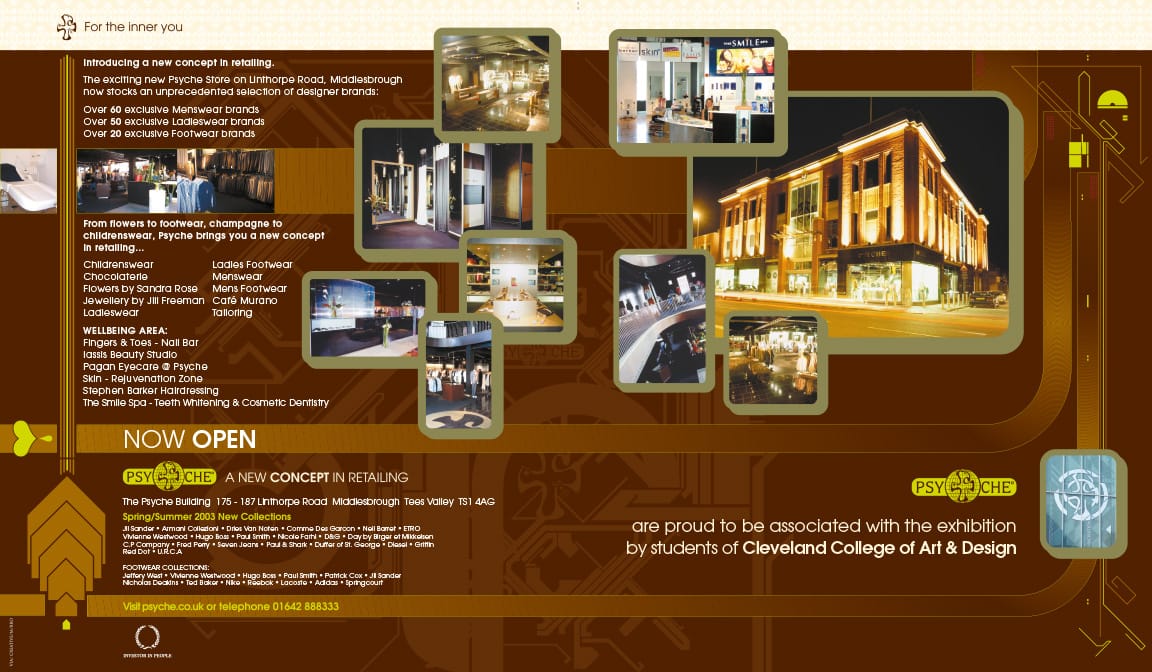
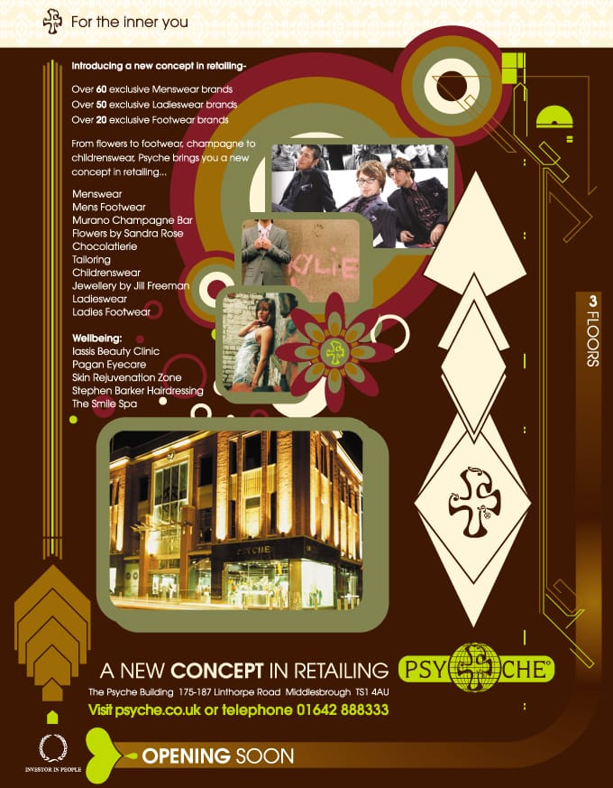
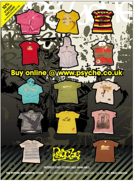
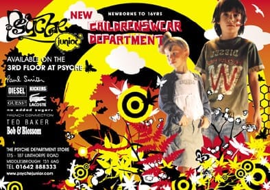
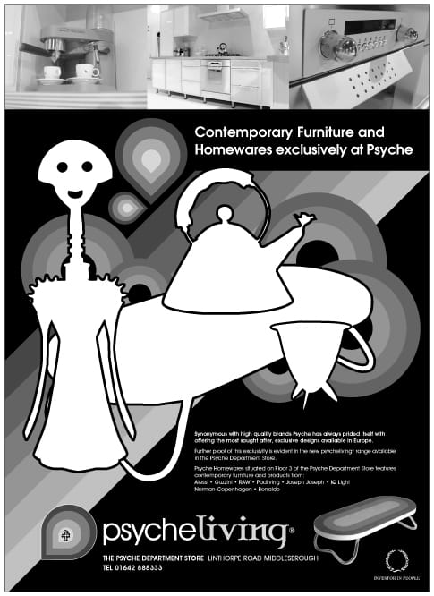
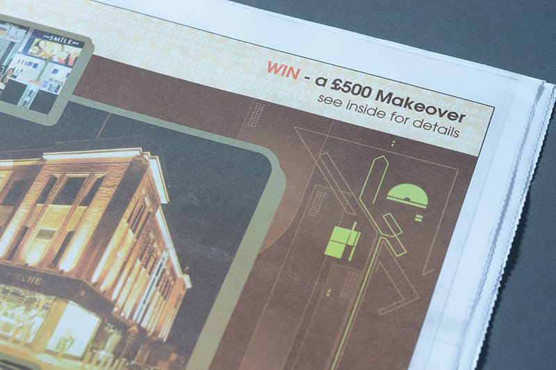
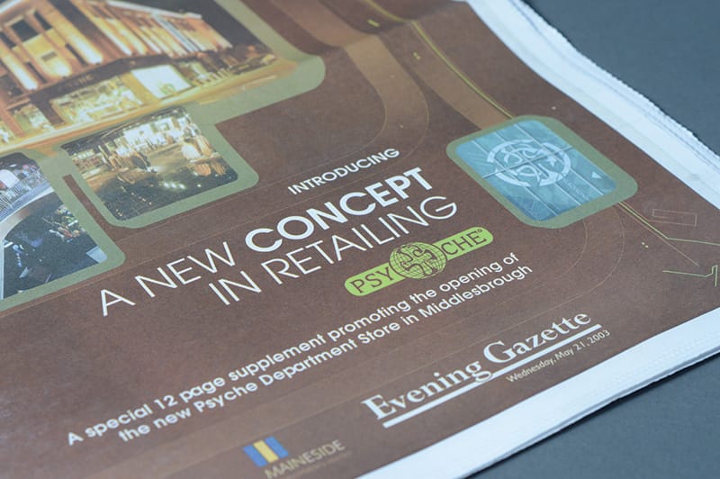
Here’s some examples of adverts we created for one of our regular clients back then, the fashion retailer Psyche of Middlesbrough:
Promoting your brand was often done with printed carrier bags
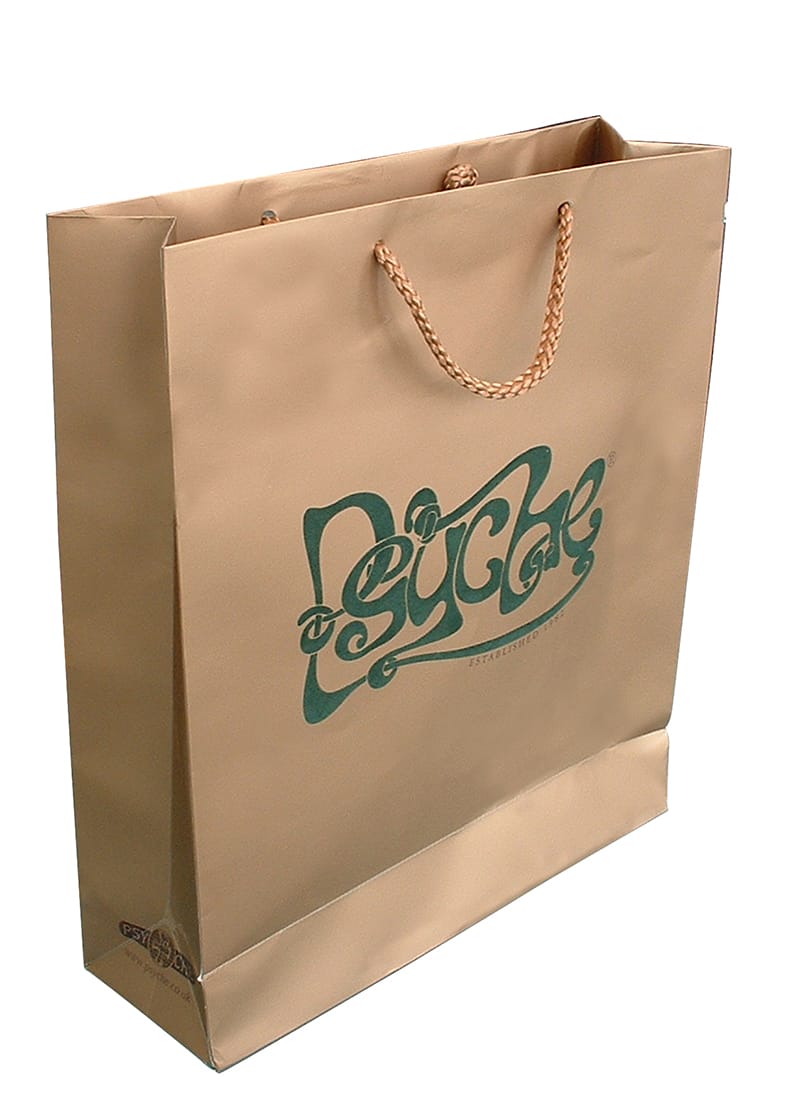
During the early 2000’s we often created a wide variety of traditional graphic design work. This included brochures, posters, folders, direct mail and also printed marketing collateral such as bags and swing tickets. Again one of key accounts at the time was the clothing retailer Psyche. On top of their advertising we often produced and managed the printing of their swing tickets, sale mailers and their very much sought after carrier bags. It was commonly known that if you paraded down Linthorpe Road with a Psyche bag you were officially part of the trendy brigade!
Their bags really were works of art, after all the designer clothes inside cost a small fortune! One particular example (shown below) featured a full coverage, metallic bronze ink print with a soft flocking material applied to the Psyche logo.
Psyche were extremely proud of their brand, at the time they invested in some of the most intricate print techniques that I’ve ever used for my design work.
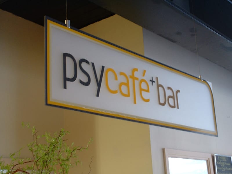
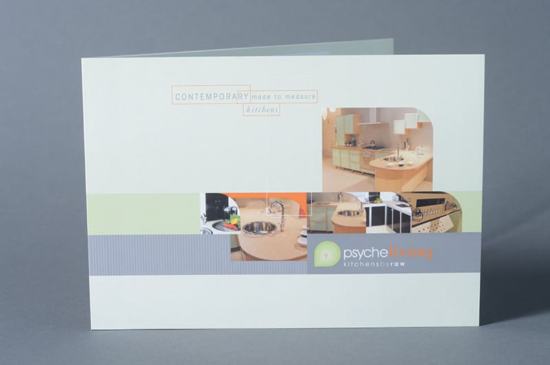
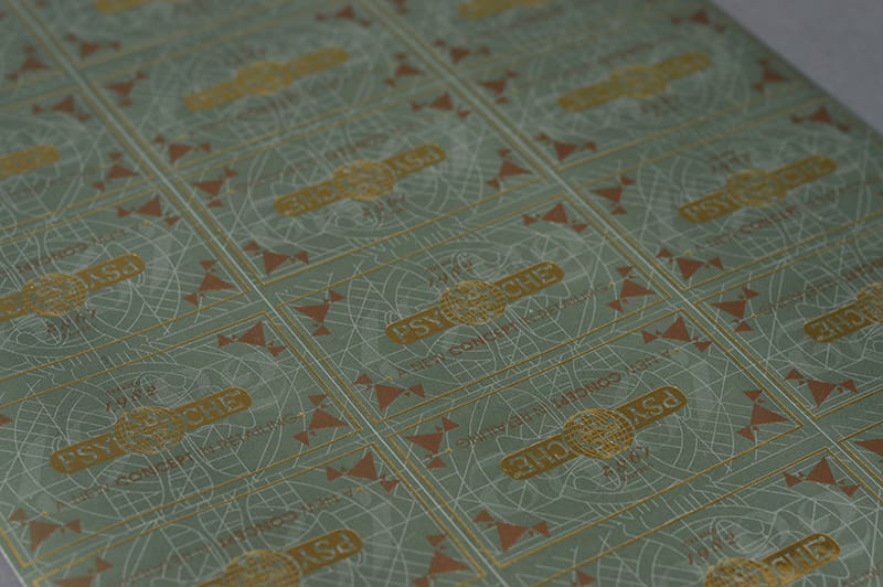
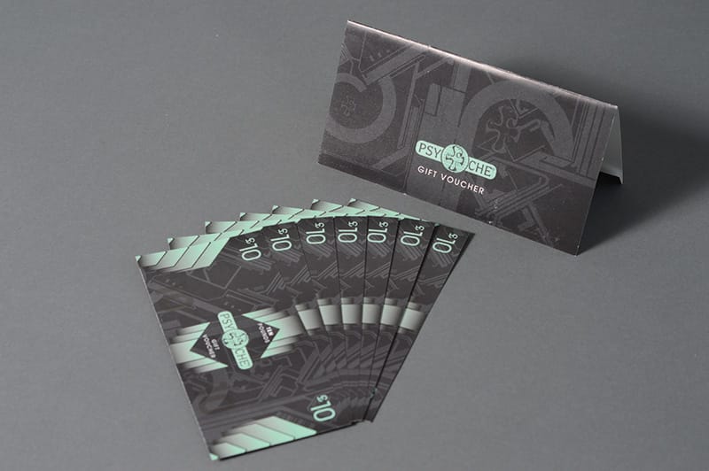
Here’s some further examples of the work I created back then including the design of their feature window at their current shop on Linthorpe Road…
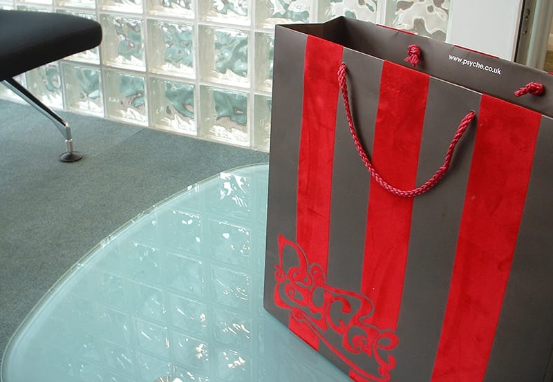
Two Psyche carrier bags printed with a flocked fabric direct to the bag outers.
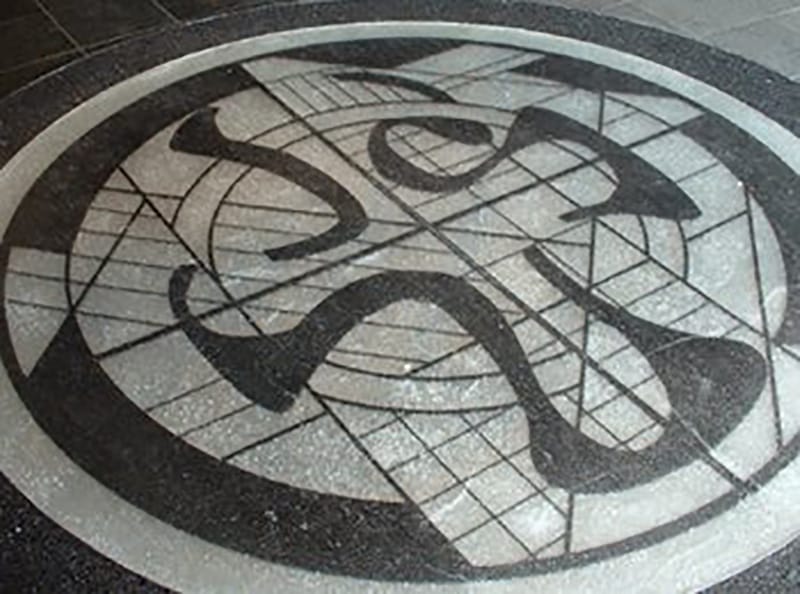
A crushed glass floor feature using the Psyche 'bird' emblem.
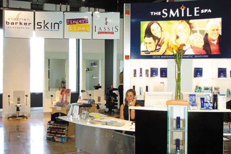
The rejuvenation zone inside Psyche, featuring skin, hair, beauty and cosmetic dentistry concessions.
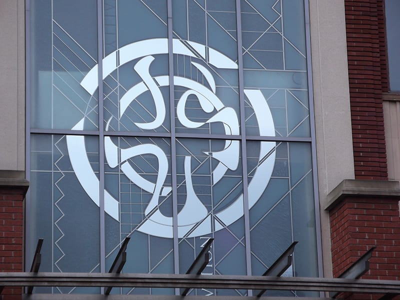
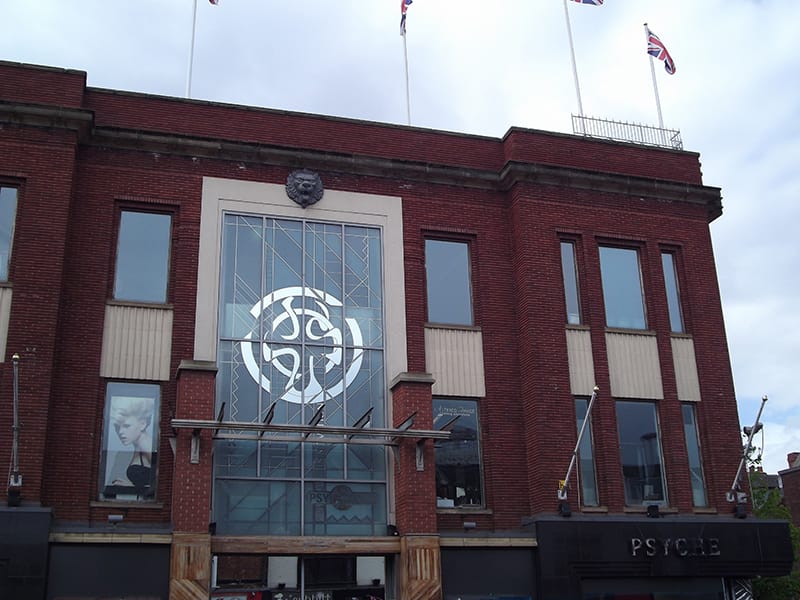
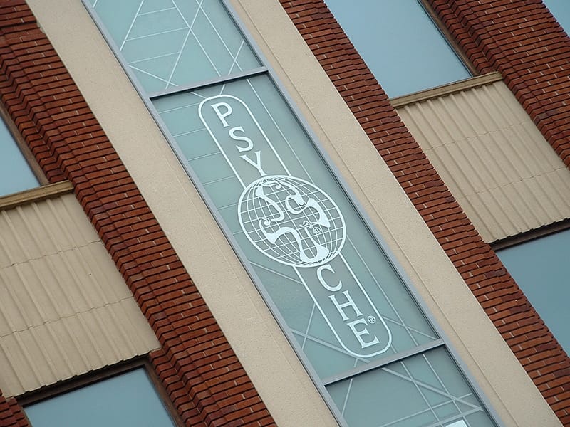
The Psyche feature window and window on the Garnett Street side on the old Uptons department store. And below a range of other graphic design and print work undertaken for Psyche clothing back in the early days of VIA...
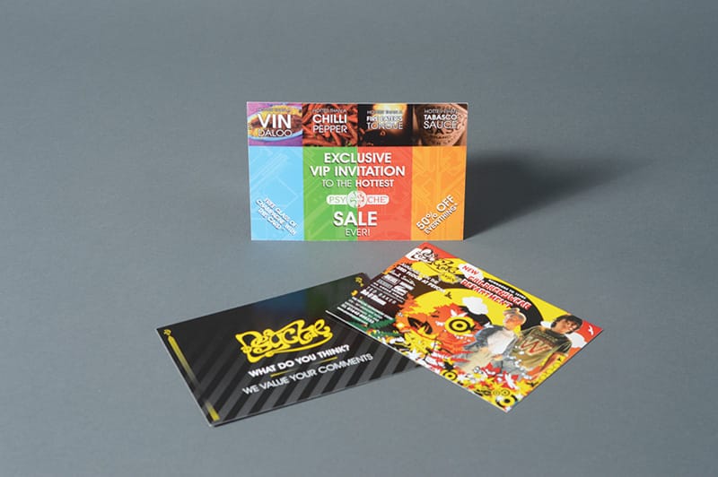
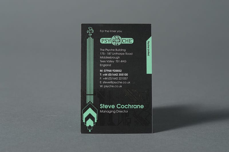
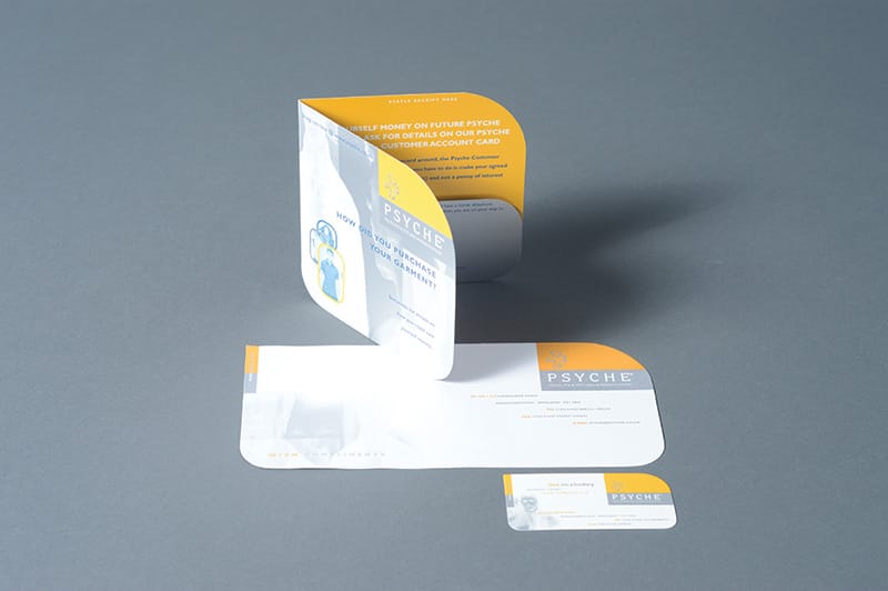
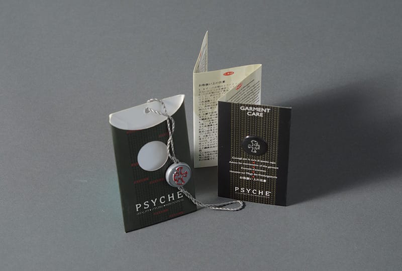
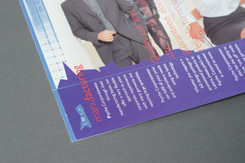
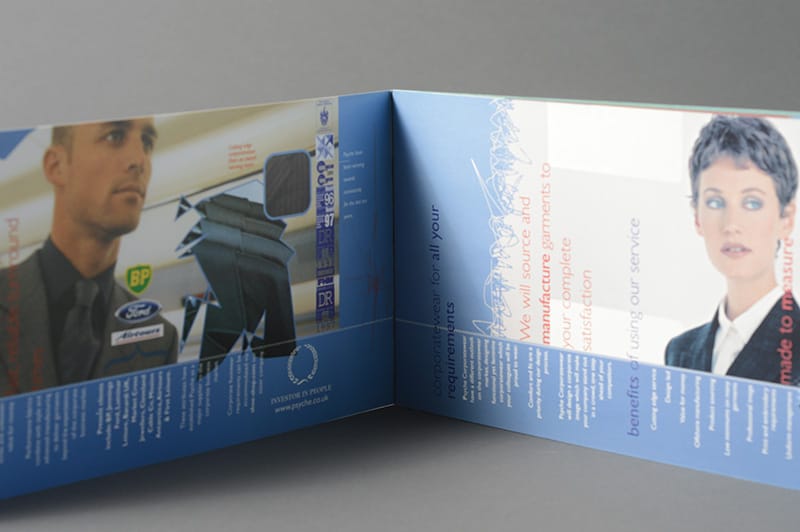
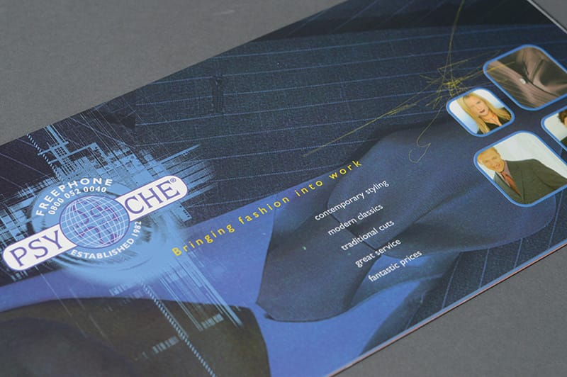
A well designed brochure was the key marketing tool for any business
So before digital media really got a grip of a company’s marketing mix the primary sales tool for any company back in the mid 2000’s was probably their profile brochure. This document had to really sell the assets and services of any company and often we tried to make a point of creating something that little bit more unique and memorable, after all they traditionally ended up on a shelf or in a filing cabinet but before they did they had to get a prospect to like what they saw and pick up the phone for a sale.
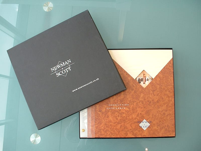
One of the most significant brochures I created was a brochure for the national shopfitting company Newman Scott. This company had a prestigious client base including Christian Dior, Austin Reed and Jimmy Choo amongst others.
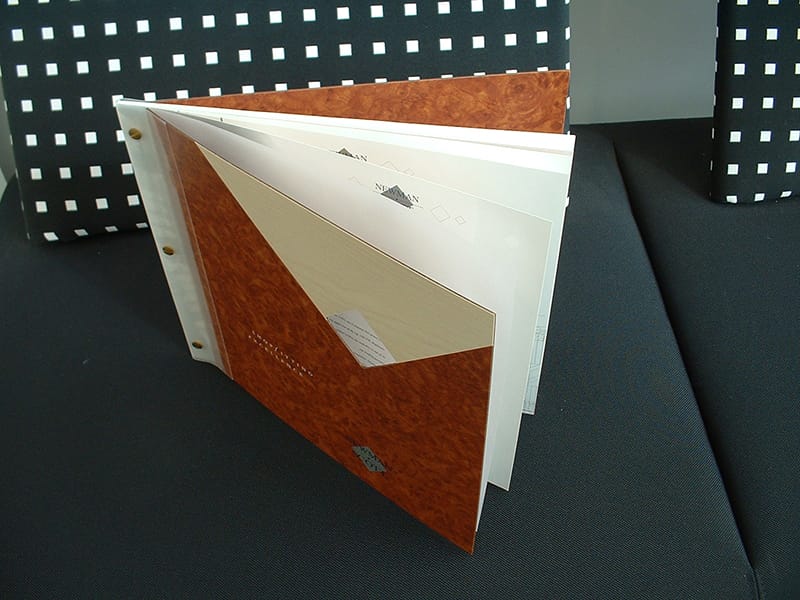
With such a high profile range of clients their company brochure really needed to sell their ability to deliver bespoke shop fit outs and as such I took this literally and proposed a format of 30cm square (album size for the older reader) and devised a front and back cover made up of two separate wood laminate boards which were spliced together and a diamond hole cut in to the front to allow one of their shop images to be visible through it.
Their strapline “Shopfitting Excellence” and their logo was screen printed to these cover boards and the front and back were bound with a clear pvc to allow the pages to be turned over when opened. Brass screw rivets were used to bind the printed sheets into the brochure and allowed for new case study prints to be added giving the brochure longevity.
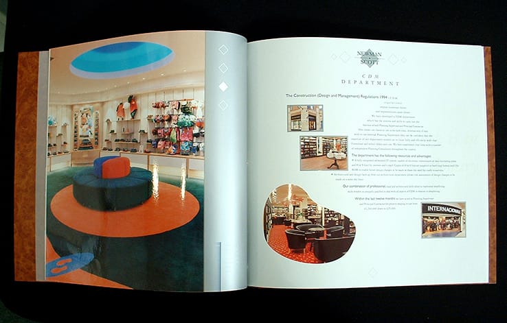
The high spec of the brochure extended to the printed sheets which were printed in full colour with an additional 5th metallic pantone silver plus a clear uv varnish all machine sealed to avoid rub off of the ink.
The brochures were hand finished and delivered to the client’s prospects in a black Weberley box fitted with a foam inlay that also housed a CD which had been burned with the company profile brochure too (early use of digital media there, pre-USB stick days!)
Needless to say that the client went on to acquire some further prestigious clients once that brochure landed on their prospects doorstep.
Here’s some images of the brochure as unfortunately my one and only file copy has been lost.

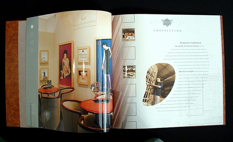
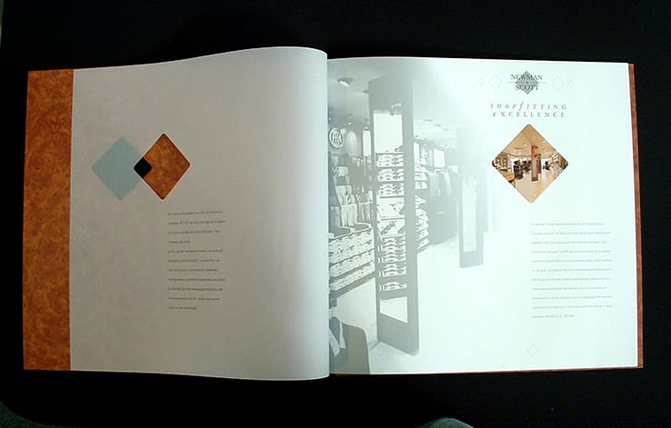
So as you can see the early days of VIA were spent mainly working on traditional design for print, advertising and any marketing campaigns we created also involved utilising a mix of the various media channels that were available at the time and consisted of the usual telesales on the back of designing promotional mailers, publication advertising, yellow pages advertising, posters, bus side and bus shelter advertising, billboard advertising and brochure / folder design.
Here are some more examples of our earlier design work…
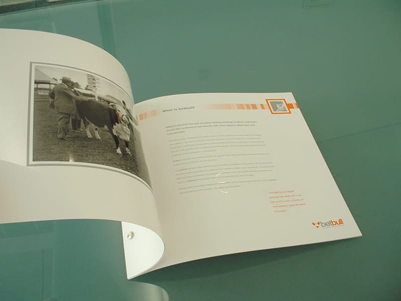
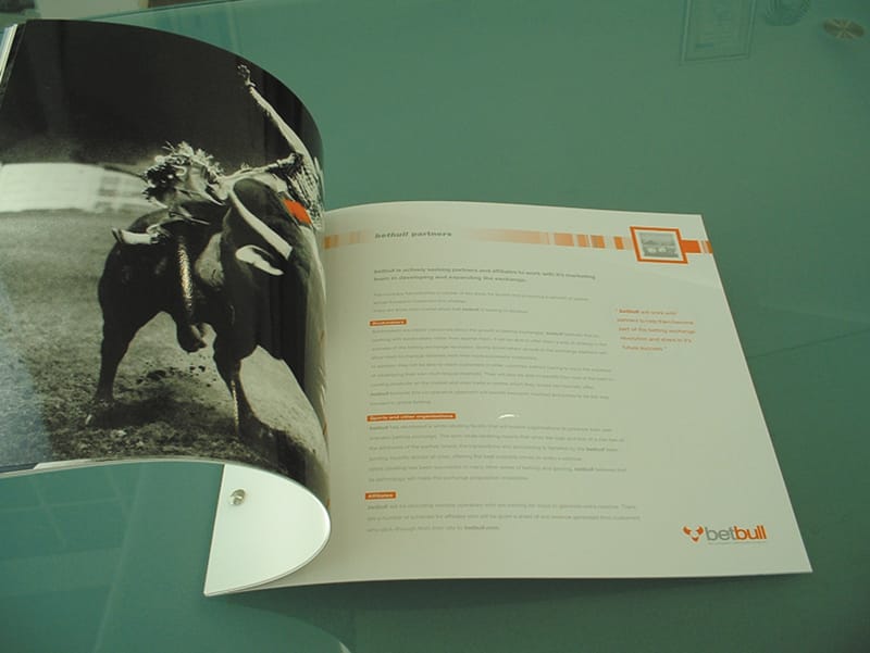
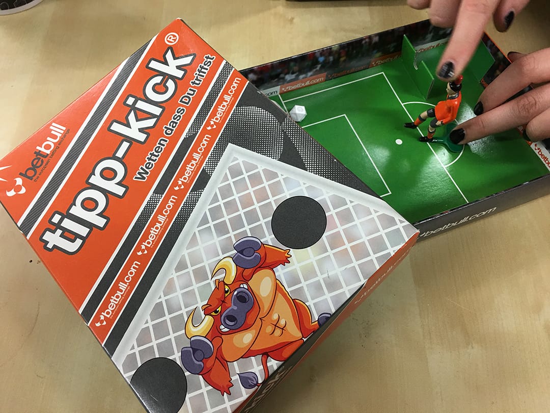
Betbull are in international betting company and we were commissioned to undertake a large level of their brand launch marketing collateral design and printing:
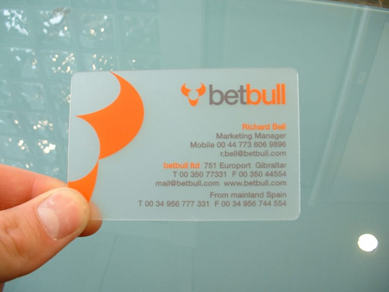
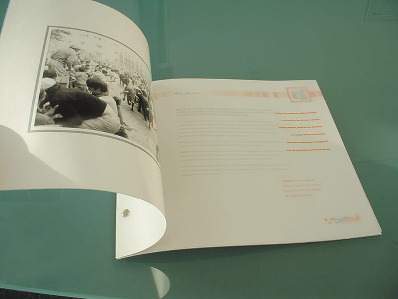
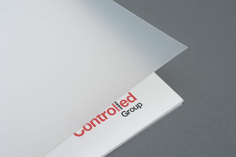
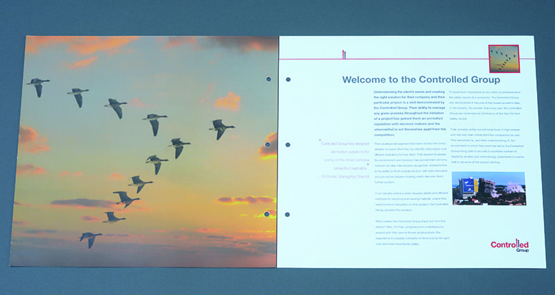
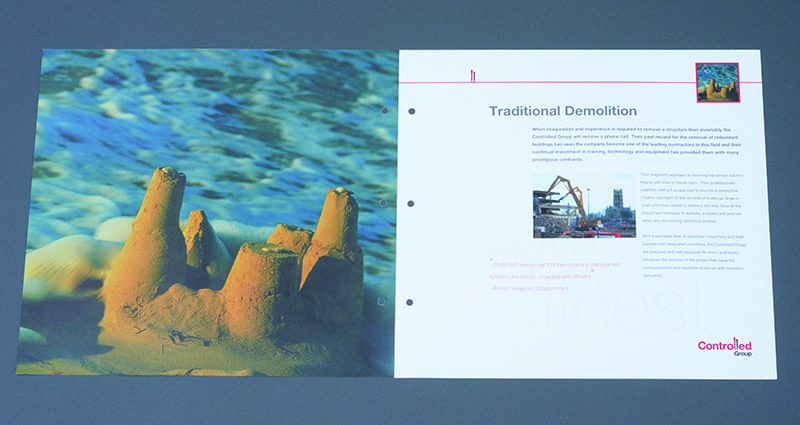
Controlled Group were a UK wide demolition company based in Wakefield, we undertook their new branding design and development alongside all of their promotional marketing collateral design including their square format profile brochure design...
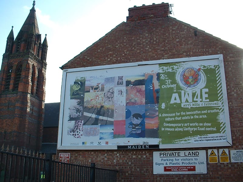
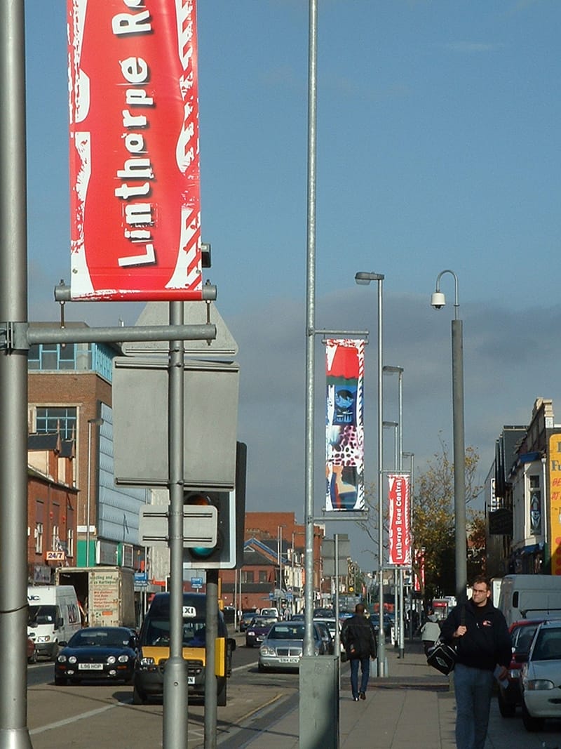
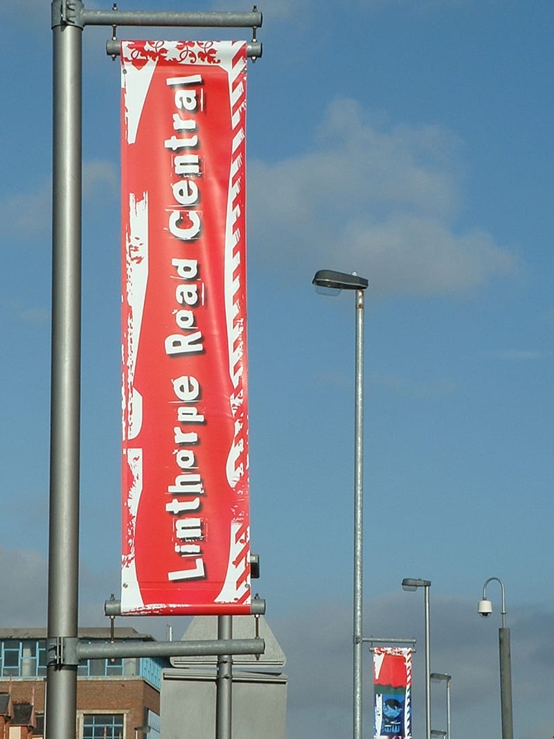
Middlesbrough Council asked us to create some new marketing materials to promote Arts Week 4 Everyone, which was a campaign that ran throughout Middlesbrough where local artists could display their works in the shop windows of retailers around the town centre. We created billboards, lampost banners alongside event collateral.
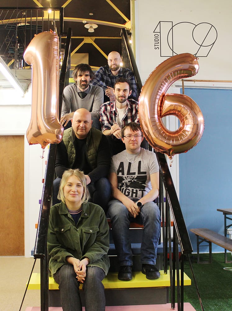
So here we are celebrating our 16th birthday and looking back at some of the great design and artwork projects that we were lucky enough to have worked on. However during these last few years we have evolved our service offering to accommodate and deliver on a wide range of new, digital media projects and digital media campaigns for our growing list of clients.
Digital media has allowed our agency to develop new ideas and new solutions for our clients as they ultimately aim to attract new business, sell products and services and expand their own marketing messages.
On searching through our backup archives for the early work examples shown above I also uncovered some of our very early website designs (circa 2007) and my next blog post will be showcasing some of those early web designs and how quickly the shape of web design and development has transformed both in terms of the software used and the devices used to view web pages.
So happy 16th birthday to us, now where’s the cake!



Comments
No comments have been posted yet!