TVCF is one of several community foundations located across the UK that are dedicated to empowering local communities to address disadvantage and exclusion. The Foundation awards grants to the community and local people who are passionate about making a difference. They approached us to design their 25th Anniversary brochure.
This is what we did...
Please choose from one of our services, fill in your contact info and we'll be in touch as soon as we can.
The Foundation (TVCF) approached us with the purpose of creating a truly memorable and unique piece of graphic design to reflect their 25 year anniversary.
The brochure had to reflect some key milestones of the Foundation together with featured stories from the key trustees.

To create something memorable we needed to identify the first point of contact, the cover. We sourced a specialist stock which was an Italian leather effect material and designed a 25th symbol cleverly created by flipping the assets of their main logo to create the 25 mark. This was applied using a debossed print technique to the leather effect stock which in turn was glued to a heavy duty board to create a robust cover. A silver foil ink was also applied as a lettepressed finish.
We designed the brochure to tell the story of the history of the Foundation. Trustees relayed accounts of the beginnings of the organisation and we broke the page layouts up with full bleed images of local landmarks to enhance the Teesside presence. A timeline graphic denoting key dates was also incorporated along the foot of each page giving the brochure an extra dimension.
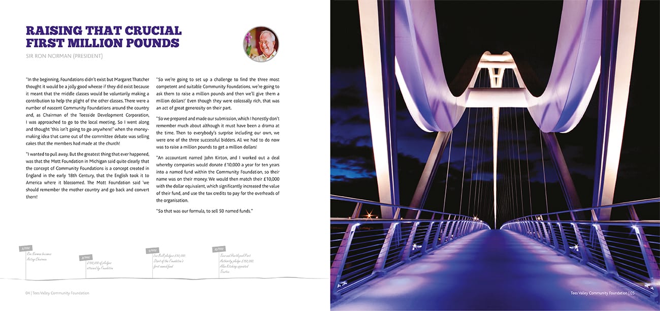
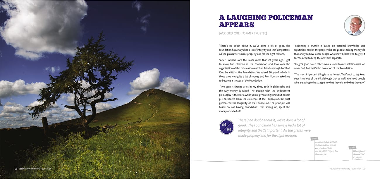
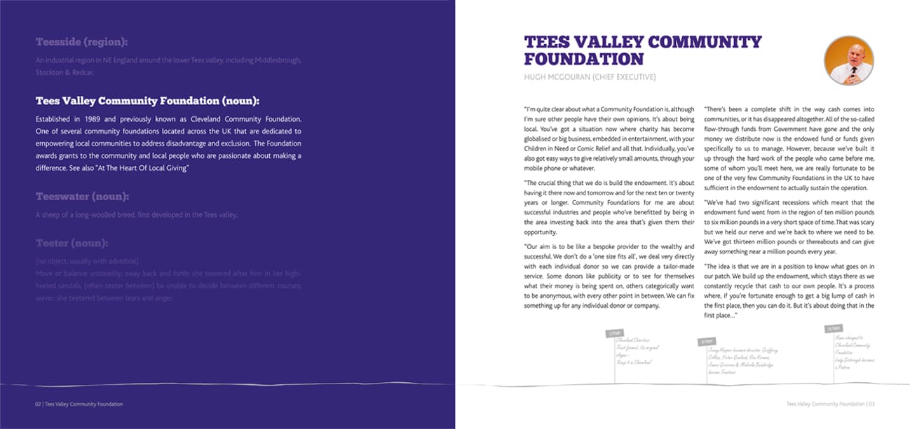
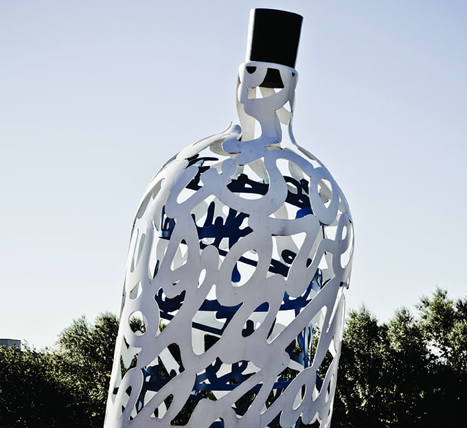
Our client commissioned bespoke photography to be used within the brochure and this added to the overall impact of the design. A range of local, iconic Teesside landmarks both man made and natural were selected to convey the region of which the Foundation had served for 25 years.






Creating the design and layout was only part of our service for this brochure. We also sourced and managed the print process, commissioning a local print company to undertake the task of completing the final finished article.
With an entourage of special print finishes the print job had to be meticulous. Pages included spot UV varnish and a 5th metallic silver ink colour as an extra touch.
A trace simulator inlay sheet was applied to give an extra sense of prestige to the brochure. This sheet carried a bold, high impact statement printed in the metallic silver ink. After applying the leather effect front and back covers, the whole brochure was sealed using nickel screws for that finishing touch.
The final brochure was unveiled at a special dinner to celebrate the 25th anniversary of Tees Valley Community Foundation. Trustees who were part of the charity at the very beginning enjoyed the brochure which also depicted tales of how the charity was formed.
If you have a potential project that we could help you with, please fill out the form below with the information and we'll get back to you.