VIA Creative

Branding design project for a renewable energy power plant in Teesside

TeesREP, New branding design

TeesREP is a nationally significant renewable energy facility that partnered with us to lead a full rebrand of their organisation. We were commissioned to create a distinctive new logo along with a cohesive brand identity system, including sub-brand variations to support different aspects of their operations and communications.

Get a Free Quote

How can we help?

Please choose from one of our services, fill in your contact info and we'll be in touch as soon as we can.

Or contact us directly

01642 804534
studio@viacreative.co.uk


TeesREP screenshot

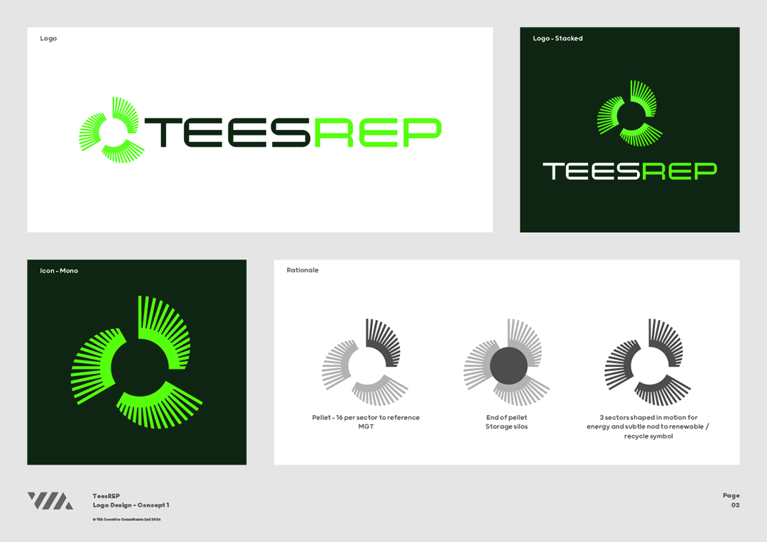
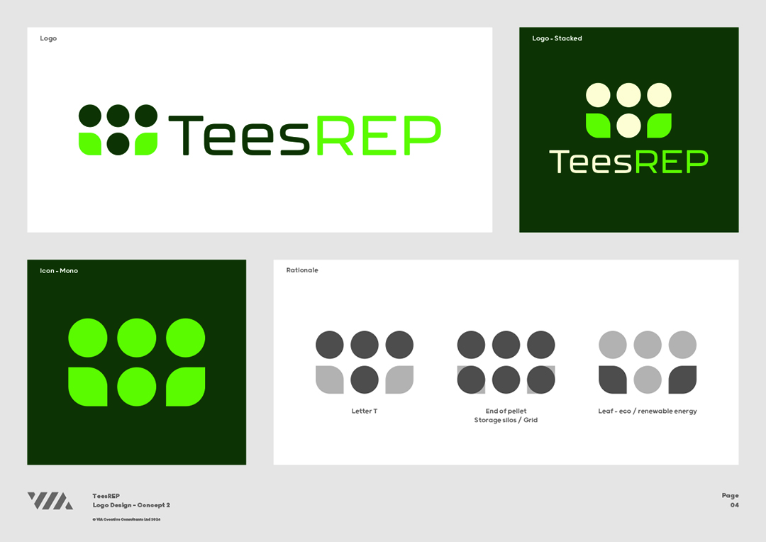
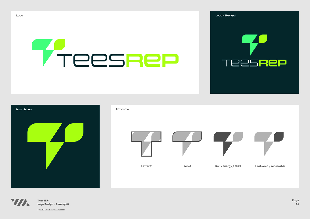
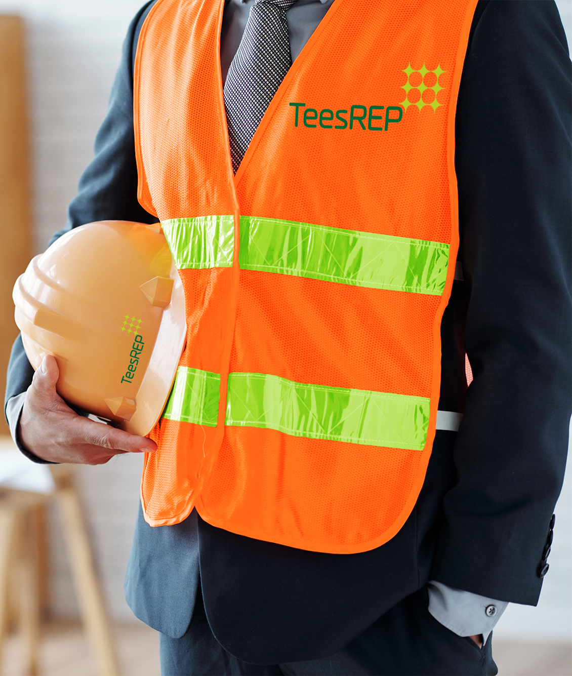
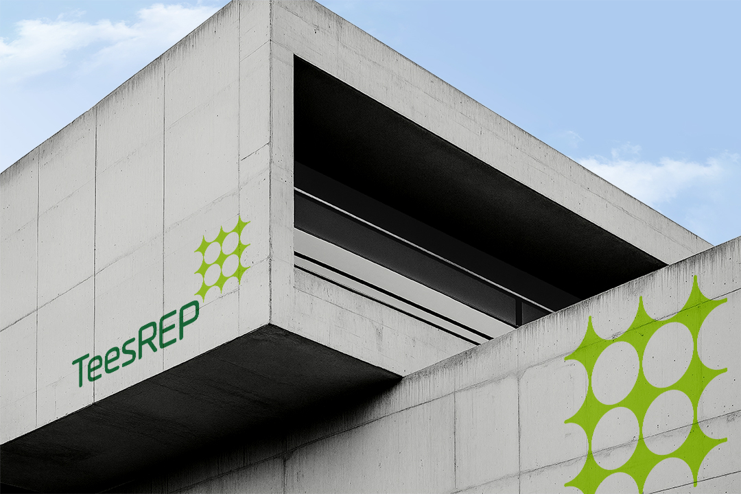
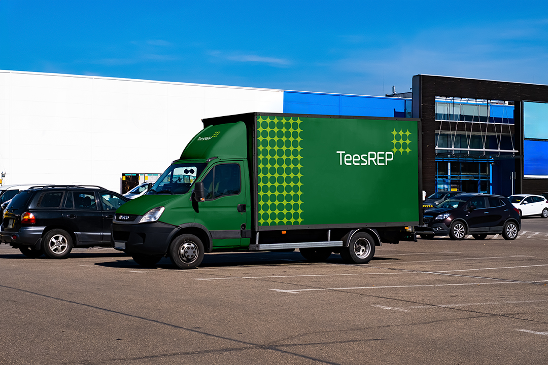
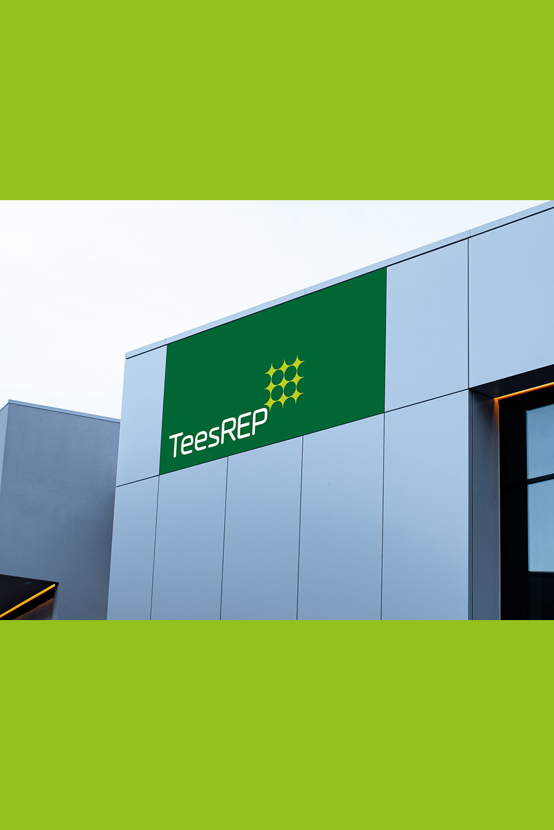
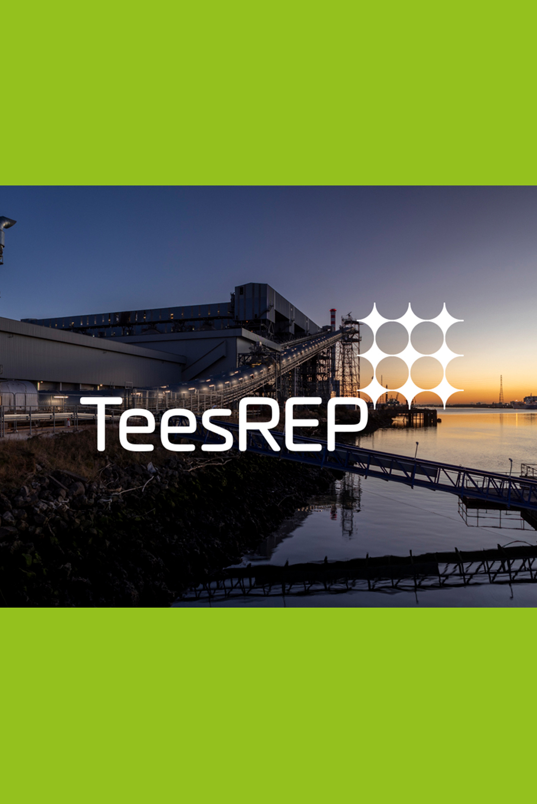
Brand identity – creating a bold new symbol that reflects the company’s central purpose

Our creative process began with a deep dive into the essence of TeesREP — exploring its mission, values and the pivotal role it plays in the UK’s renewable energy landscape. This discovery phase laid the strategic foundation for a brand that is both authentic and future-focused.

To ensure the new identity was both distinctive and relevant, we carried out a comprehensive analysis of sector peers and visual conventions across the energy and infrastructure space. This insight guided us in crafting a brand presence that confidently sets TeesREP apart — dynamic, considered and unmistakably aligned with their ambition.


Some initial concepts

Our approach to the TeesREP branding project was grounded in collaboration and creative exploration. As a design agency with deep expertise in brand identity development, we crafted a wide range of initial concept designs — each strategically tailored to capture different facets of TeesREP’s vision, values, and sector positioning.

Throughout the process, we worked closely with the TeesREP team, facilitating regular feedback sessions to ensure every creative direction aligned with their long-term goals. This iterative, insight-led approach enabled us to refine the visual identity with precision, ultimately arriving at a solution that is both meaningful and visually impactful.

TeesREP wireframe
TeesREP wireframe
TeesREP wireframe

Crafting a modern brand, with renewable energy at its core

The new TeesREP logo reflects the organisation’s pivotal role in renewable energy, balancing modernity with clarity to communicate clean power, innovation and environmental responsibility.

At its core is a unique geometric motif: sixteen negative-space circles arranged in a 4x4 grid (16 silos are used in every biomass plant), forming a star-like symbol that represents energy generation and its distribution back into the UK grid. This refined use of negative space captures both technical precision and sustainable intent.

The wordmark features a clean, rounded sans-serif typeface, reinforcing approachability and stability, with subtle emphasis on “REP” to highlight the plant’s renewable energy credentials. A bold green palette signifies growth and environmental focus, while a vivid lime accent conveys energy and forward motion.

Designed for maximum versatility, the logo maintains clarity across all formats — from signage to digital applications — with a structure that scales effortlessly at any size.

Crafting a modern brand, with renewable energy at its core image

Crafting the brand elements

Every element of the TeesREP brand has been carefully considered to tell a unified story. From the symbolic energy-inspired icon to the purposeful use of colour and modern typography, each detail contributes to a visual narrative that reflects TeesREP’s commitment to sustainable power and innovative energy solutions.

Application of the new TeesREP branding

Looking ahead, the brand will be rolled out across a wide range of marketing materials — from corporate literature and internal communications to display material and digital platforms. We will also be designing and developing TeesREP’s new website. This platform will serve as a central hub for stakeholders, partners and the public, offering clear, engaging access to project information, operational data and sustainability credentials.

With this rebrand, TeesREP is now equipped with a confident and contemporary identity that reflects its status as a leader in the renewable energy sector — and we’re proud to have helped shape the next chapter of its journey.

If you have a potential project that we could help you with, please fill out the form below with the information and we'll get back to you.

Follow Us Online

Address

Unit 2G
Brighouse Business Village
Brighouse Road
Middlesbrough
TS2 1RT

Get Directions
Teesside Digital Technology Finalist

All content © 2024 VIA Creative Design & Print Ltd