The Task
We were commissioned to undertake a rebranding exercise for Morgans Autosalvage. Alongside this we undertook a full website redesign plus development of a quicker back-end parts search feature with integrated ecommerce system.
Creating a fully bespoke e-commerce, online marketplace that was able to communicate with the client’s stock management system.
Please choose from one of our services, fill in your contact info and we'll be in touch as soon as we can.
We were commissioned to undertake a rebranding exercise for Morgans Autosalvage. Alongside this we undertook a full website redesign plus development of a quicker back-end parts search feature with integrated ecommerce system.
We established that the most important aspect to the marketplace would be the search and filter, that would need to include customisation options for users to narrow down their search.
This would be followed by the store, products, cart and checkouts pages. With the aim to streamline the checkout system to increase conversion and sales.
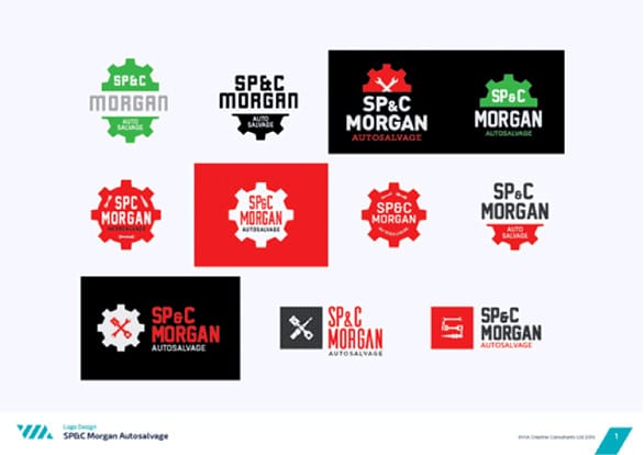
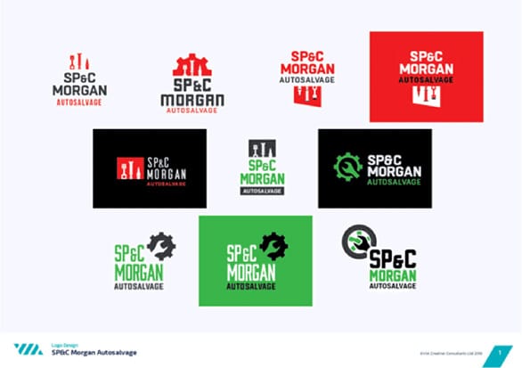
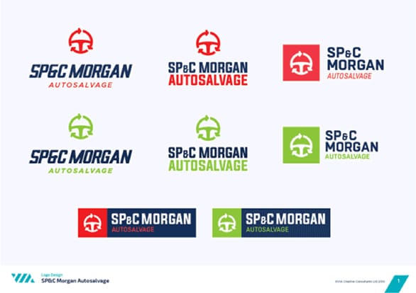
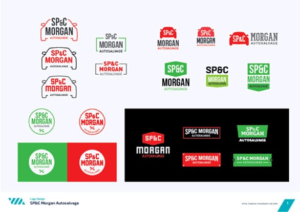
As part of the project we were also commissioned to undertake a company brand refresh. We submitted dozens of ideas which included new colour schemes and styles to give the brand a more dynamic and modern feel.
The result would be applied to the signage and stationary, as well as establishing the new look and feel for the website.
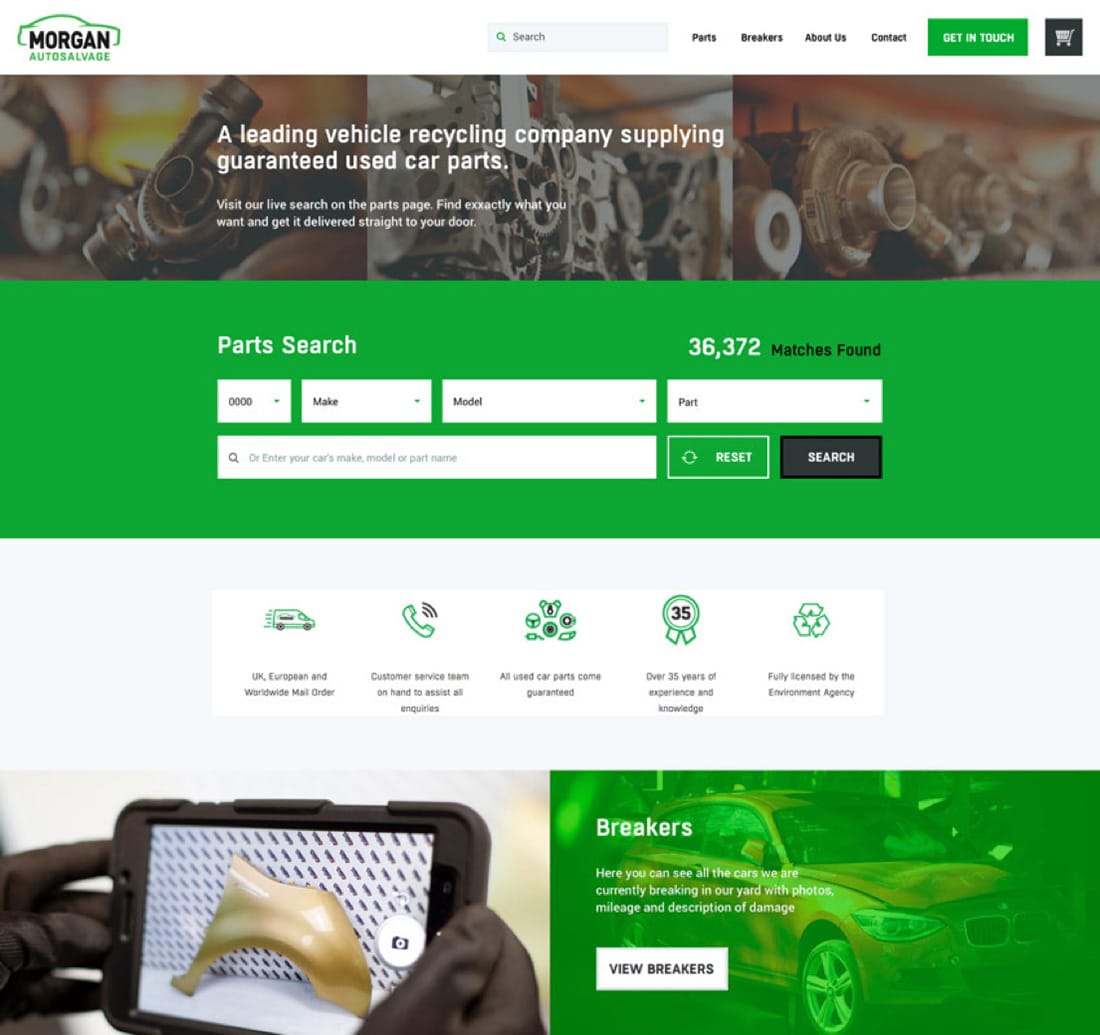
The user experience would be centred around the parts search feature - which will be used by Morgan’s customers to find a very specific car part.
This would be followed by a product, cart and checkout pages to create a streamlined store experience that would need to carry over to the mobile website.
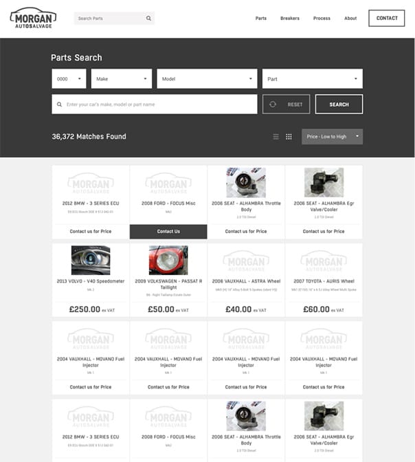


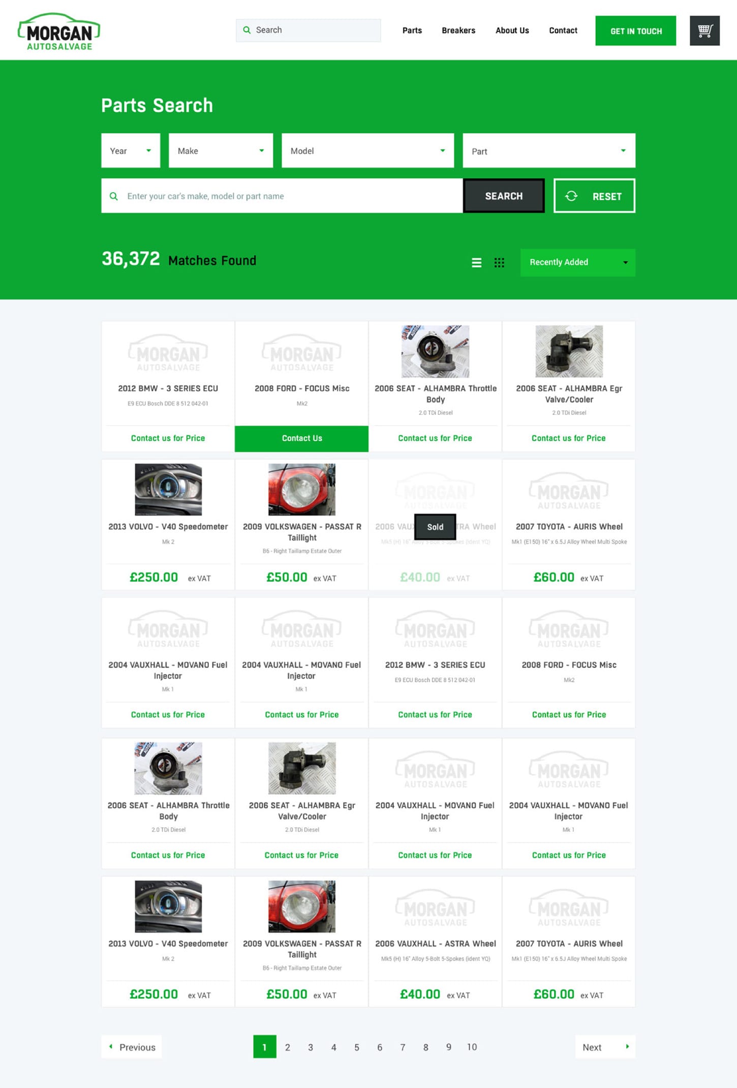
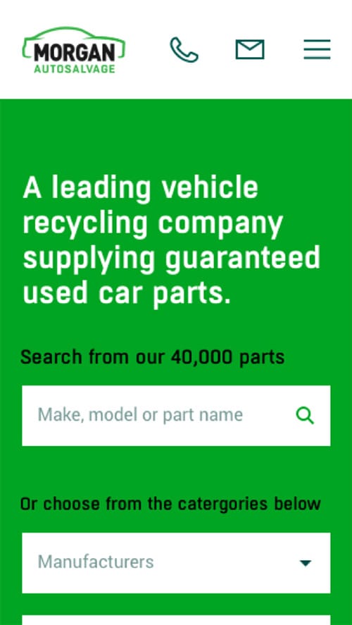
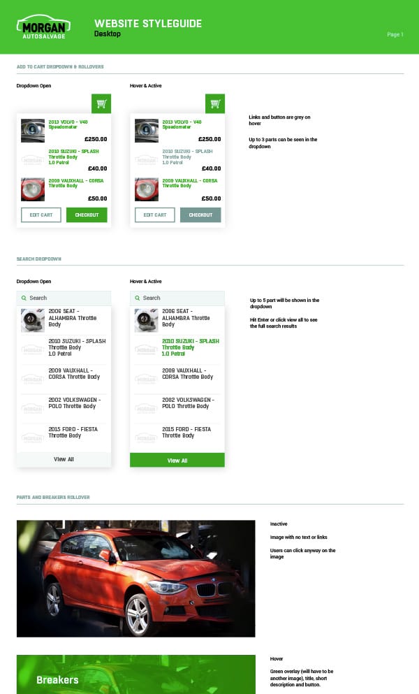
The parts search function would be at the centre of the overall design of the website, featured as one of the first things a user would see on the homepage. And the search function would be accessible on every page.
The filter options needed to allow users to find a specific part for any car from nearly 40,000 parts; sorted by year, make and model.
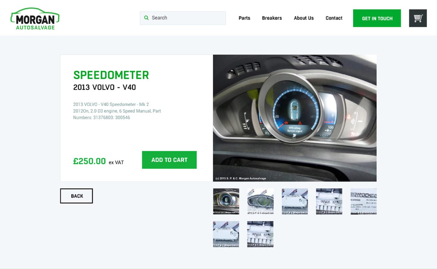
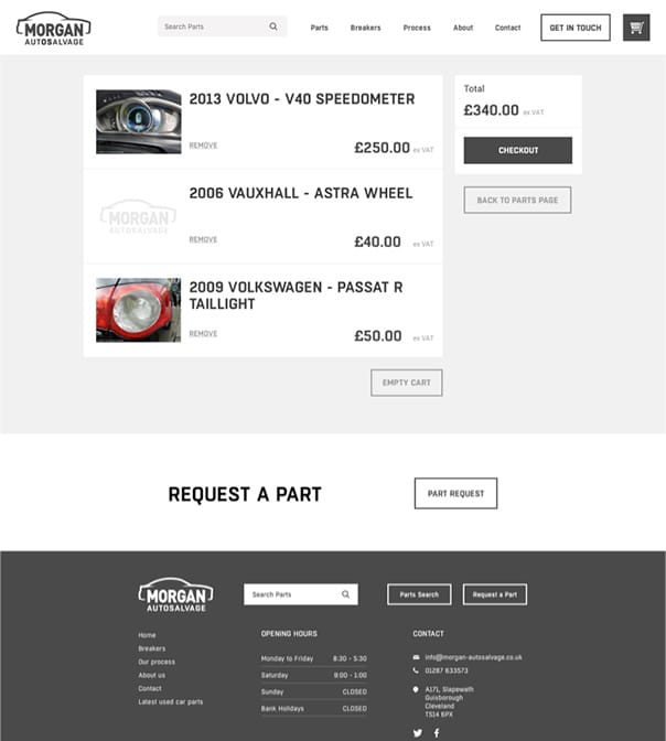
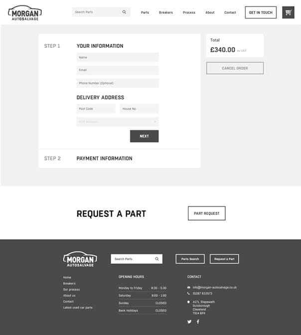
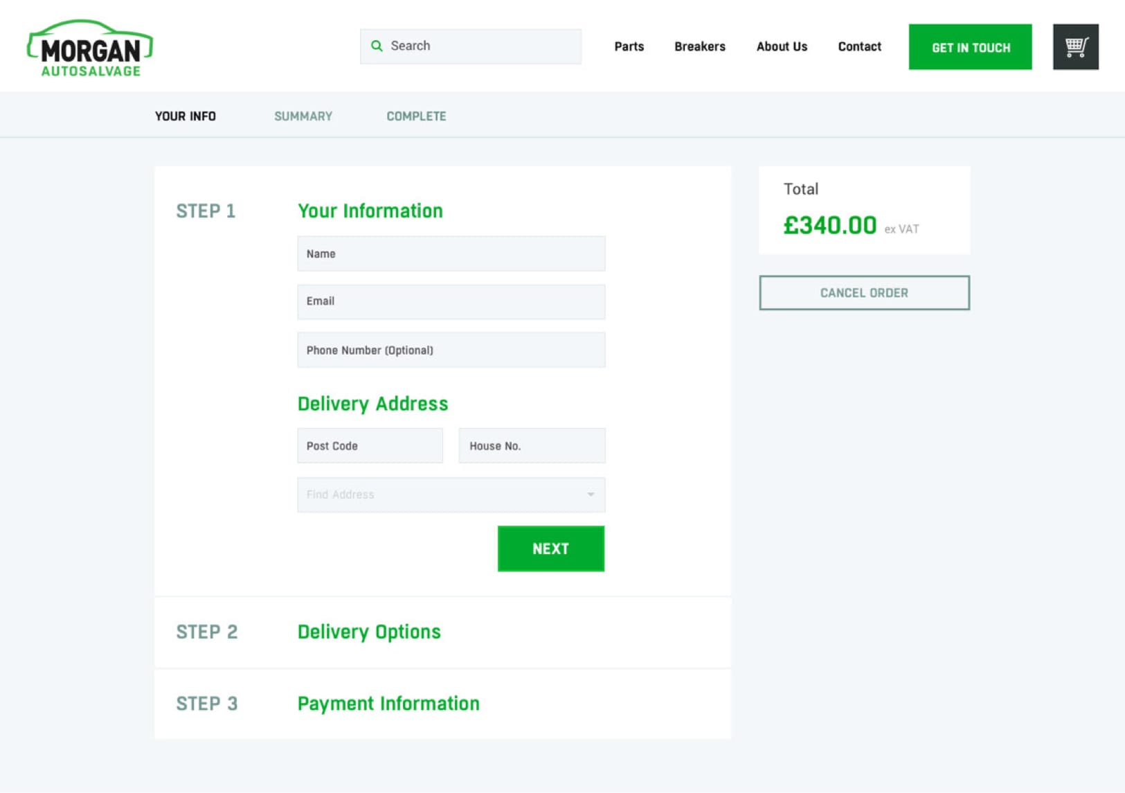
The cart and checkout are key features to any e-commerce site, and need clear an easy to understand user interface.
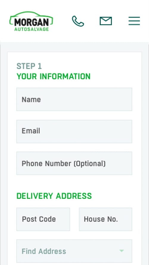
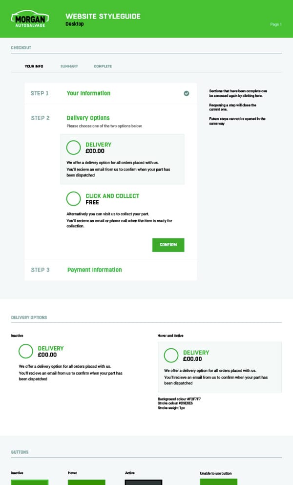
The checkout process would include the 3 steps highlighted in the design, to show users the length of the overall process.
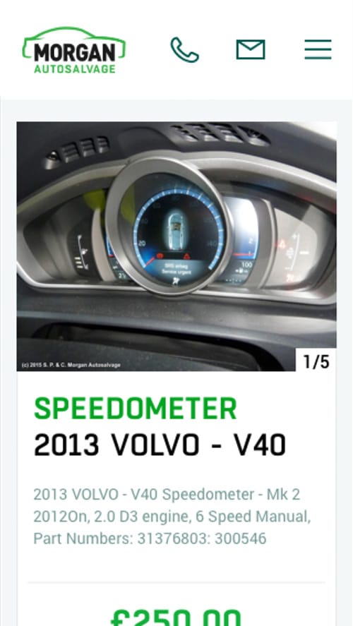
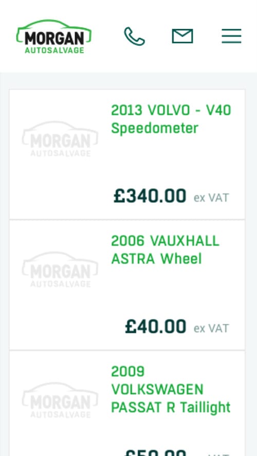
Just like the desktop site, the parts search is at the core of the website’s user experience. Due to our mobile first approach to design, the search and store are available on mobile with all the functionality of the desktop version.
The mobile site would include clear sticky call to actions on the products, cart and checkout screens, aming to streamline to purchasing process.
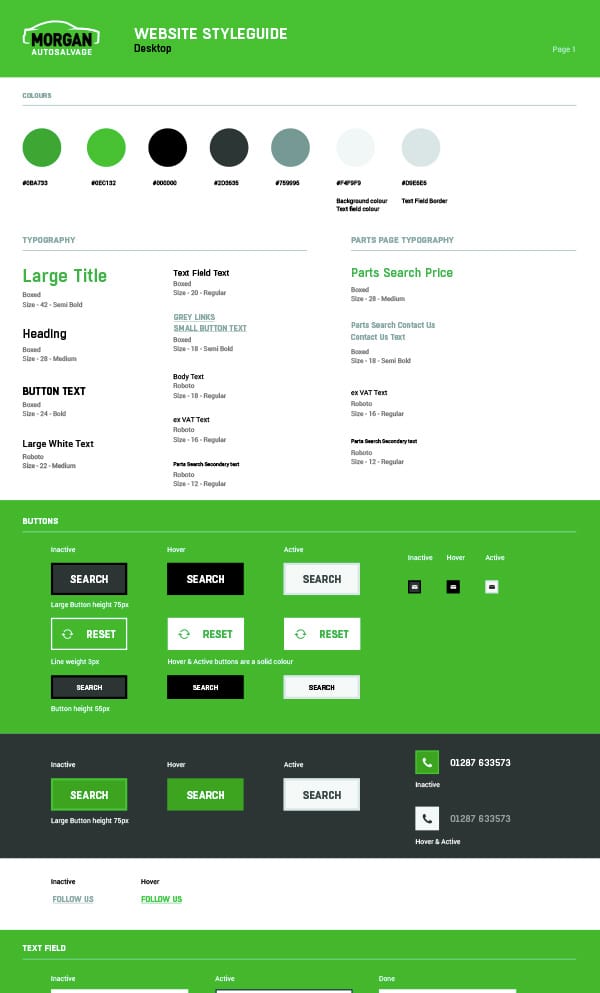
The new rebrand and website includes an indepth styleguide to illustrate how the new brand, colours and fonts can be applied across the new digital experience. Complemented by all new photography.


If you have a potential project that we could help you with, please fill out the form below with the information and we'll get back to you.