How we transformed the visual identity of an established cladding company from a white van stereotype to an industry leading organisation.
Please choose from one of our services, fill in your contact info and we'll be in touch as soon as we can.
Following a period of rapid expansion and broadening of their service offering, Midas challenged us to transform their old company logo and overall company image into a new brand that would reflect their dynamism and forward-thinking culture.
Our branding project discovery and research phase saw us really get under the skin of the company. Extracting underlying information and knowledge from key stakeholders allowed us to move effectively onto the next phase: our idea generation.
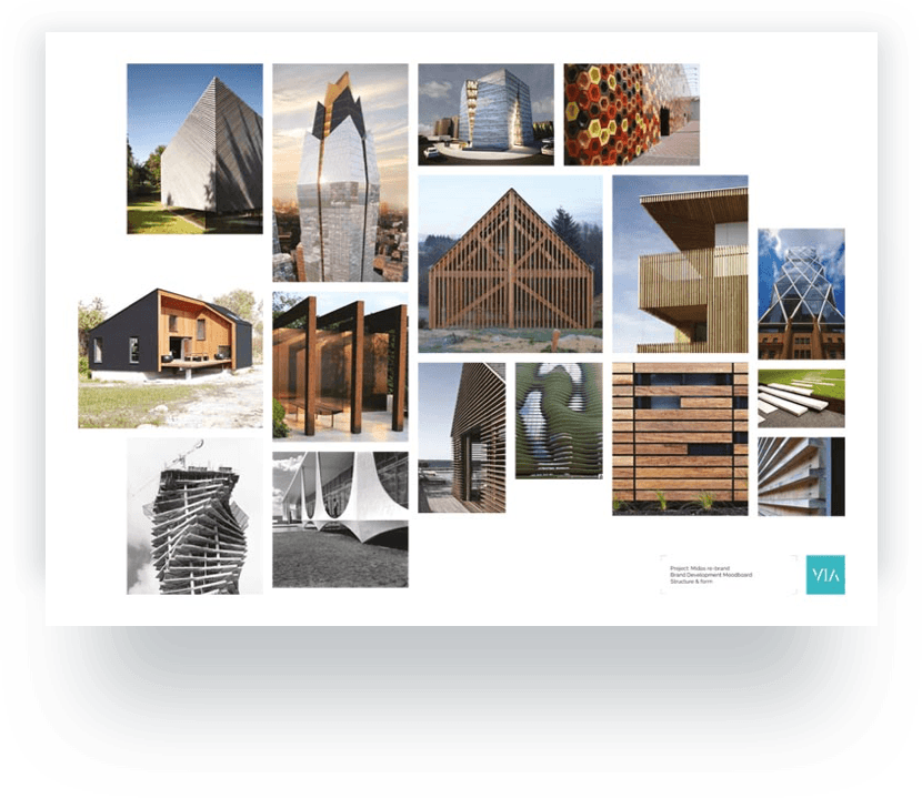
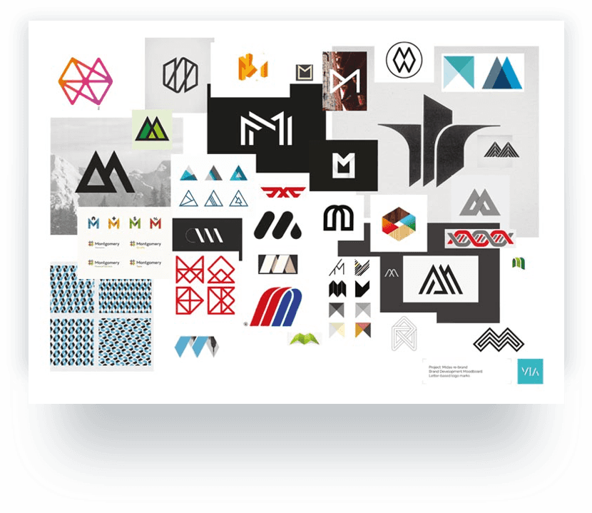
Following our extensive research and ideas exploration stage, we submitted a range of ideas for consideration to the company. All ideas were presented with sound rationale that conveyed the results of our brand workshop, stakeholder concerns and aspirations and project discovery phase.

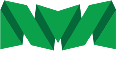

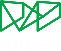
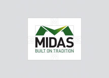
The building blocks that make up the logo - the 'M' mark, the logotype and the strapline - are stacked; a subtle reference to the industry. The strapline acts as a foundation, the experience and history instilled in the company providing a solid platform from which to grow and develop.
The overarching, almost roof-like 'M' mark evokes feelings of protection and security - a reference to the work Midas undertakes with its clients. It is reflective of the all-encompassing nature of Midas, enveloping all the services they provide 'under one roof'. The arrow shape within the mark denotes accurancy and dynamism and also points directly to 'Midas', adding emphasis to the company name.
The shape of the 'M' is also a subtle reference to Middlesbrough's Transporter Bridge, reflecting Midas's heritage and beginnings.
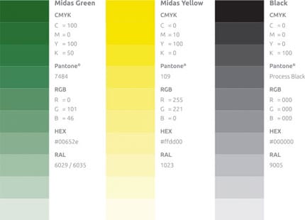
The Ubuntu font family, from Google Fonts, is the primary font for the Midas brand. It was chosen to compliment the Midas logo whilst also fitting well with the overall feel of the company. It has an extensive range of weights, making it flexible for a variety of uses across different media.

The sceondary font for the Midas brand is Roboto Slab, from Google Fonts. It has been chosen because it works alongside both the primary font and also the Midas logo.

Along with the updated brand, Midas wanted to completely overhaul their web presence. Utilising the new brand, we designed and built a new, fully responsive website, focusing on user experience and effectively promoting Midas's core services. The new site delivers much richer content that looks beautiful regardless of the user's device.
Our provision of creative services for Midas also extended to marketing collateral. The brand was applied into a wide range of additional applications aimed at conveying a consistent and professional image across all marketing channels.
Additional scope of work included:
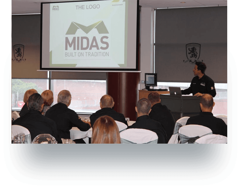
"We hired VIA Creative to help us through a very important step for us, a re-branding that not only included changing the company logo and developing a new website but helped us redefine our company ethos and culture.
Right from the initial stages, it was clear to see that VIA is a forward-thinking, creative, professional and passionate agency. VIA collaborated extensively with me and my team in order to get the right result."
If you have a potential project that we could help you with, please fill out the form below with the information and we'll get back to you.