Public sector websites are generally awful. Visually unappealing and dated, poor examples of how to engage with users when their primary aim is to enable easy to find information. Hartlepool Borough Council commissioned us to help bring two of their subsidiary sites into the 21st century: Destination Hartlepool - a tourist information site; and Invest in Hartlepool - an information resource for businesses in the area, as well as companies looking to relocate there.
Please choose from one of our services, fill in your contact info and we'll be in touch as soon as we can.
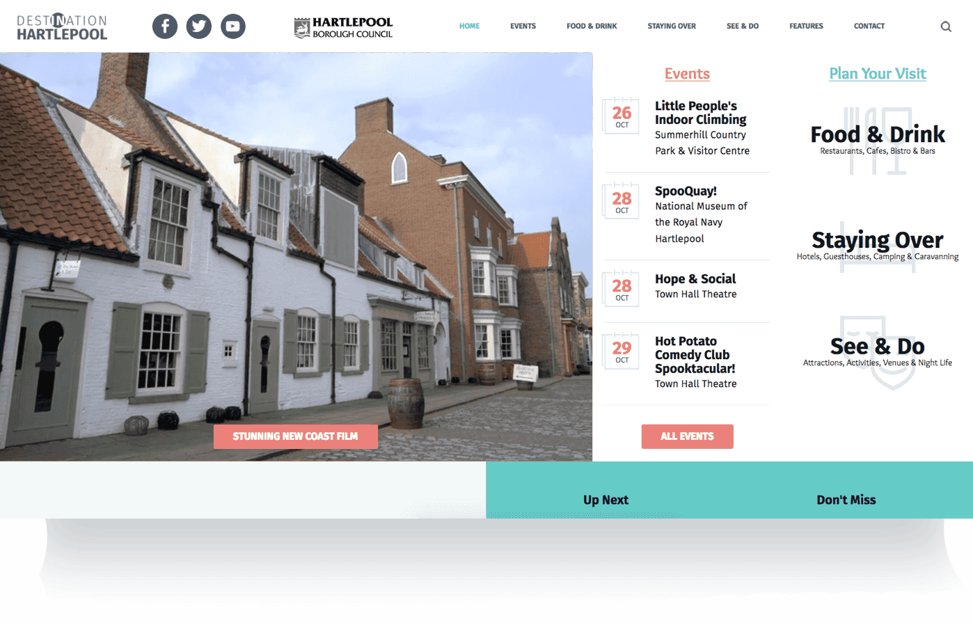
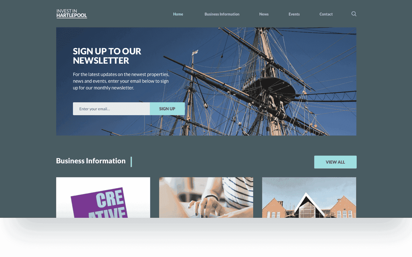
How do we take, not one, but two outdated websites with existing content and make it accessible for a wide-ranging market, make it beautiful regardless of the users' device, and above all, solve the users' problem in as short a time as possible.
Our concept was driven by a thorough, in-depth research and discovery phase that determined the users' flow, ultimately providing a vehicle for the user to find the content they want via the most direct, uncomplicated and logical route possible.
The previous site had been neglected and was in serious need of an overhaul, both in terms of its visual appearance, user interface design and functionality. The challenge was to design and build a site that would help inform prospective visitors about the range of events and activities available, presenting key information in a non-fussy format.

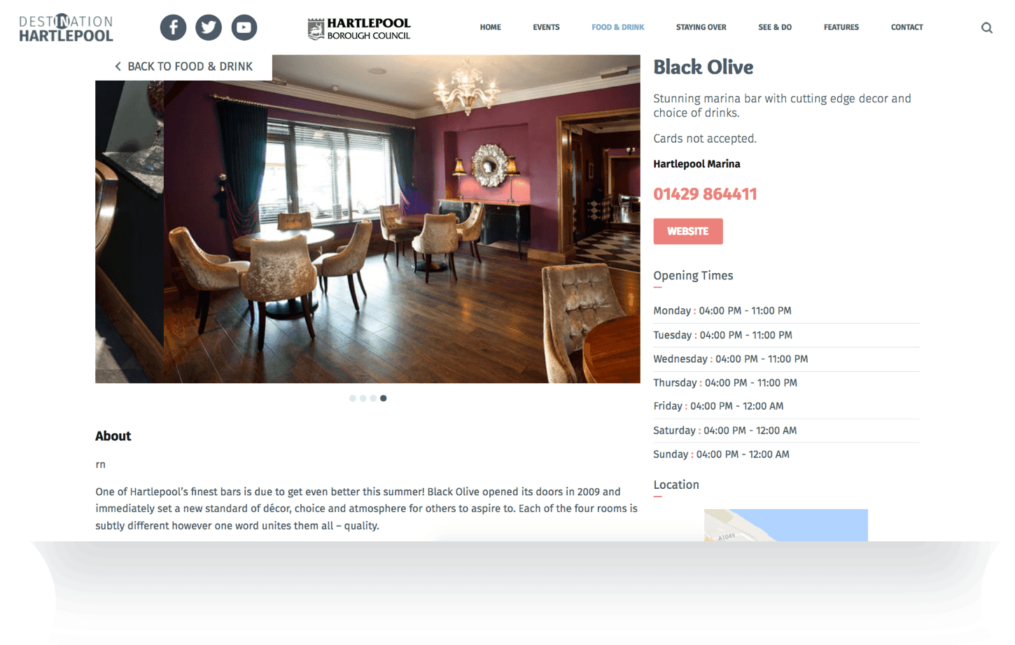
Our vision for the design of the site was clear: timeless, user focused & content driven. This was backed up by strong and clearly consistent user interface elements.
One of the largest early stage tasks was to bring together all content from all domains. How we collated and analysed that amount of content did determine the future of the project, something we never underestimated.
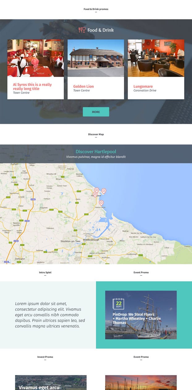
For mobile visitors, we opted to produce a range of bespoke icons that helped streamline the design of the site for mobile views. We paired the image views from the desktop to flip to the abbreviated view on mobile with these icons adding another user experience dimension on smaller devices.
Through constant communication with HBC, we designed a site which really focused on delivering content to the user with seamless and logical navigation. We stripped out any unnecessary clutter which made for a much cleaner, simple design.
We designed a functional, stylish UI system supplemented with a fresh colour palette and pixel-perfect icons, aiding navigation and making for a much easier and enjoyable user experience.
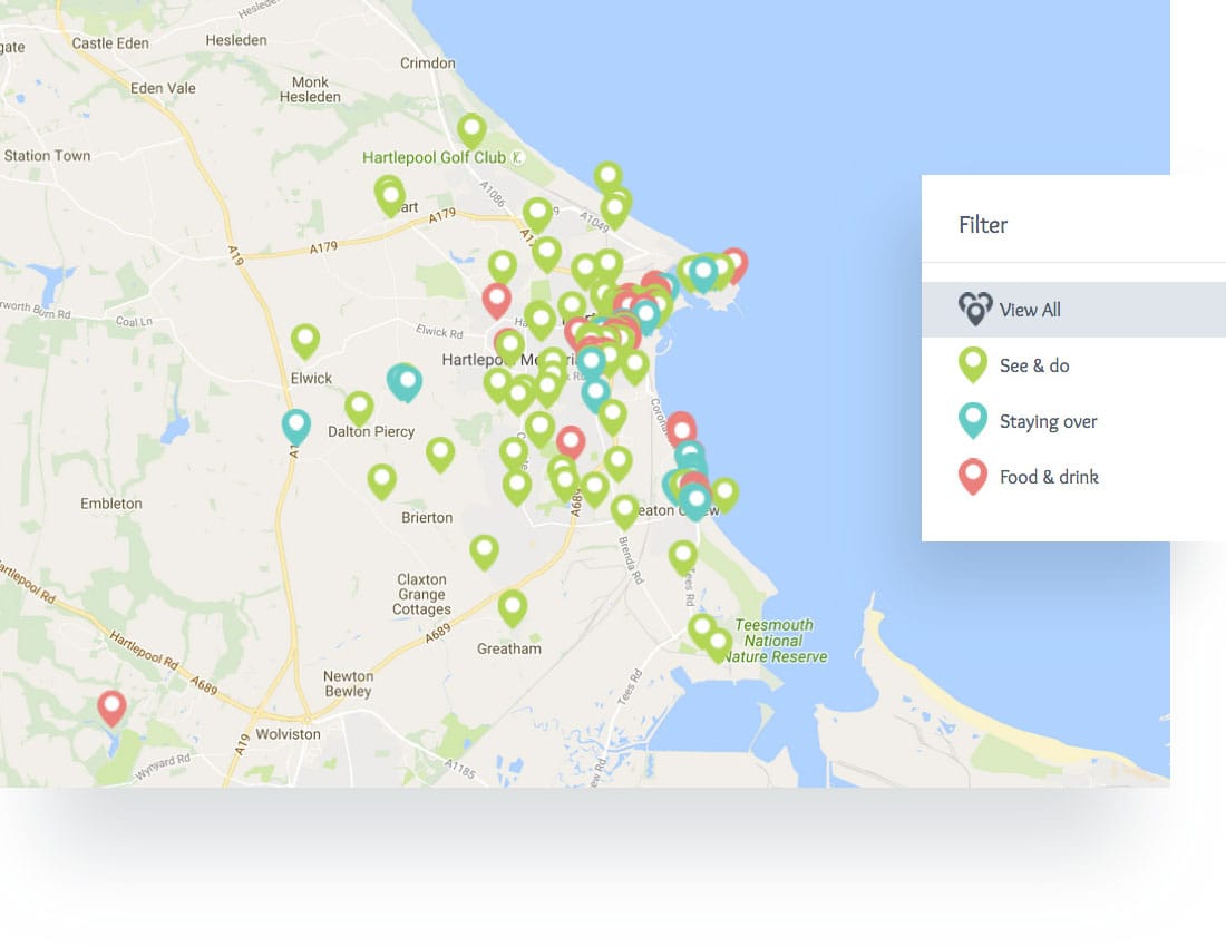
We proposed a bespoke filter solution to show the categories a user could access to define their specific choice for finding somewhere to stay, a place to eat or an activity all within the confines of the Hartlepool region.
From the early project discovery phase, a senior developer began working directly with the client and designers to understand the required infrastructure. How many visitors does the site get? What are the current overheads and resources being used?
We began to paint a picture of the minimum required server infrastructure and start the process of deploying and readying that architecture.
Throughout the early design stages, our development team had been keeping one eye on the progress to date. Not only did this allow a seamless transition for the client and the project to a new department but crucially our development team provided technical feedback to the designers, ensuring that everything designed was in fact technically possible within the proposed constraints set by the client.
During the front-end development phase, our team began to design/install the core database structures and populate with the content provided.
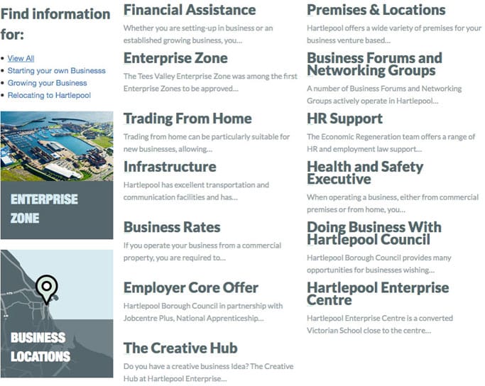
The second site, aimed at business owners, was content-heavy, and careful consideration was given to the user journey in order to break down the barrier between the users and the content.
A content-first approach was key to the success of this project. This allowed us to review, plan, categorise and sort the information into a consistent, easy-to-absorb format.

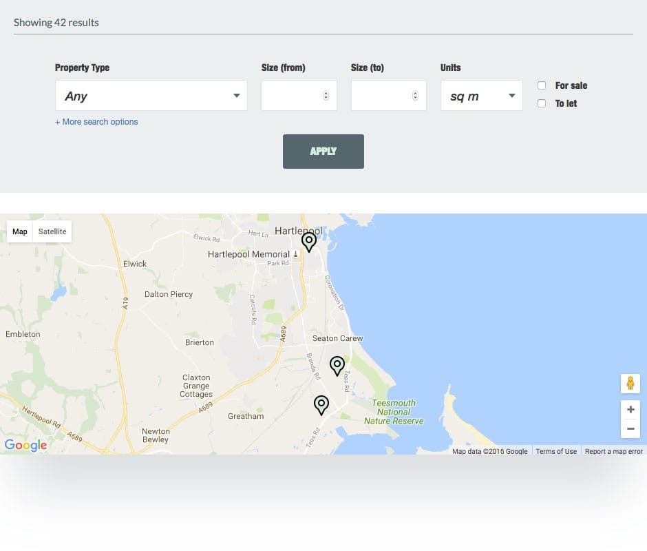
As an extension to the filter feature on the Destination site, we created a bespoke filter function that lets users define the property type they required and then filters and displays the available properties on a Google map interface. A small but important feature centred around making the user experience as easy as possible.
The new website includes an enhanced business information section which also included a news directory feature. All aspects being fully editable by admin and allows for posting of images and content, a date reference was also be included in this feature.
The council requested that the new site have the ability to develop new page sections with specific URL's to promote individual projects and services. However we took this to the next level.
We gathered, cleaned, normalised and prepared the various site data, we then built a separate REST API (Representational State Transfer Application Programming Interface) which was accessible through a standard set of JSON (Javascript Object Notation) requests.
By abstracting out the actual page data and defining a single interface to access that data we can create any number of 'clients' (software/apps/websites) who can access that data without having to 'redo' the content information every time.
Also, should a project detail change - we update the data within the API and every client (software/apps/websites) automatically gets the latest data.
After we separated out all of the page information (it will of course as far as a user is concerned be on the website), it allowed the website management platform to manage and specialise in the marketing of campaigns and managing of general page content.
If you have a potential project that we could help you with, please fill out the form below with the information and we'll get back to you.